These are past homework assignment's I've worked on during my time in the concept art course for beginners at CG Spectrum that portrays a time where I felt a drastic improvement in my abilities as an artist. Before the program, drawing was just a side hobby that I had little confidence in. After taking the plunge and attempting a serious artwork program with feedback from some fantastic mentors, Humza Khan and Joel Carpenter, I felt serious growth in my art that I never expected. Although it's a bit embarrassing to show older works and the less than perfect pieces I've made, I hope that they do a good job of showcasing my initial growth.
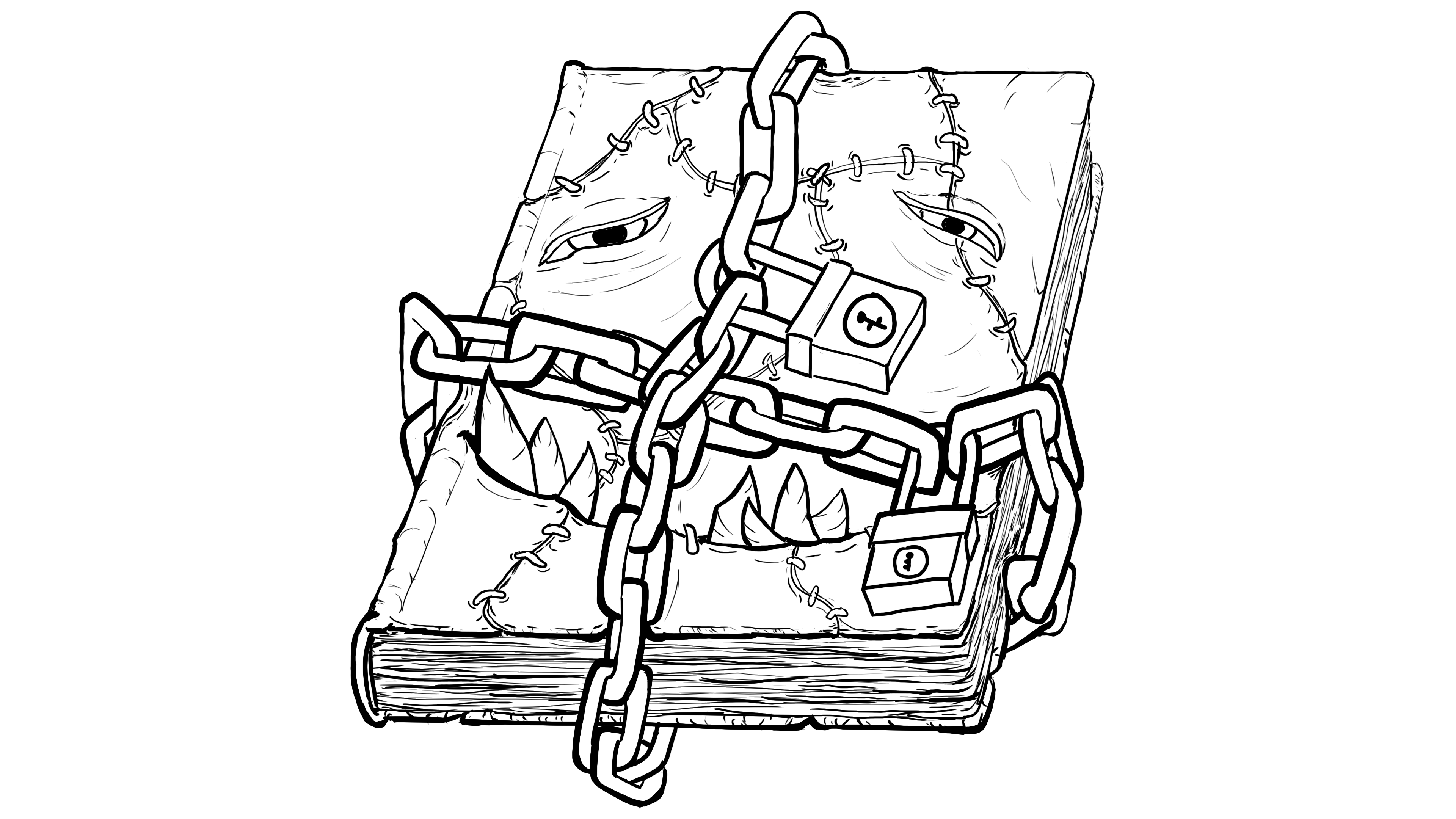
Basic Lineart
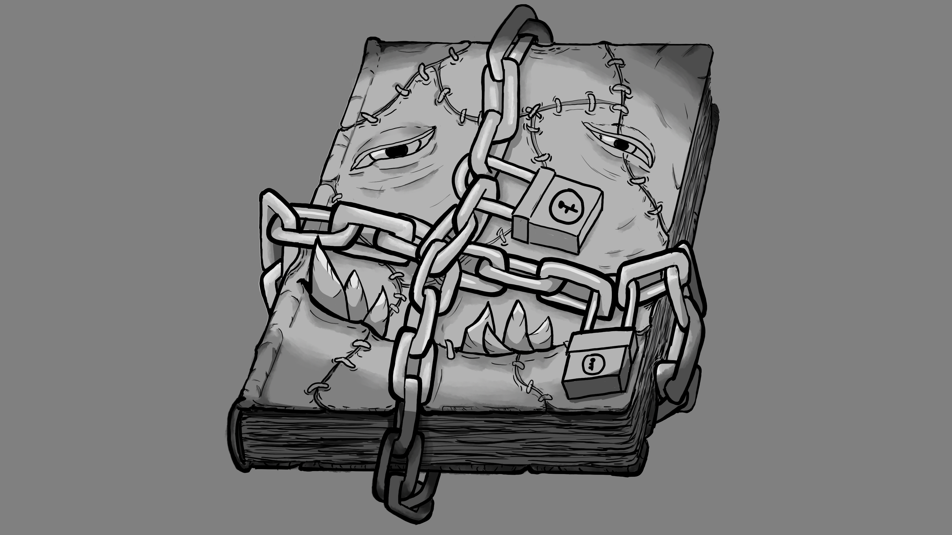
Introduction to values/Application of light
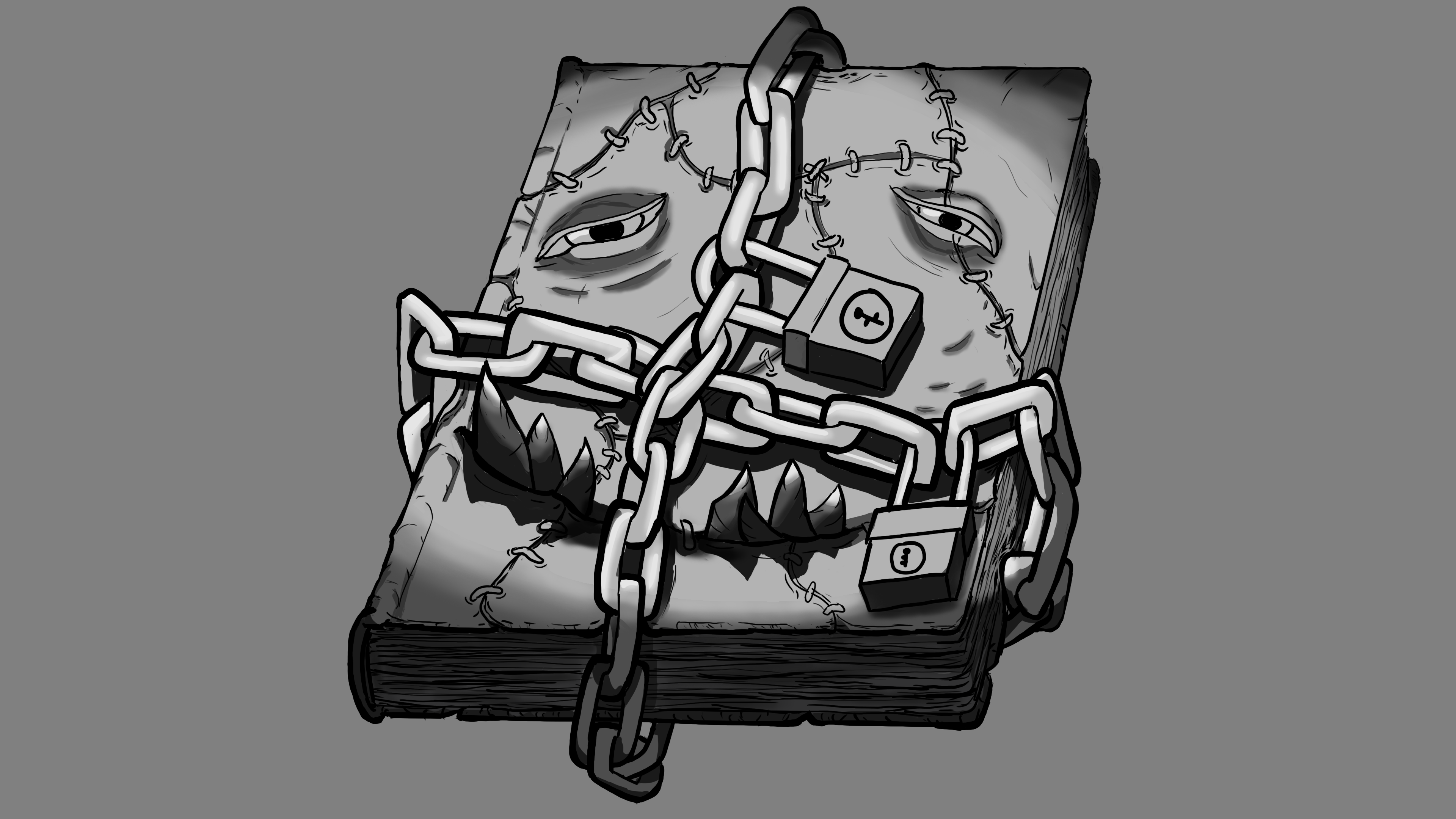
Round 2 after feedback from mentor
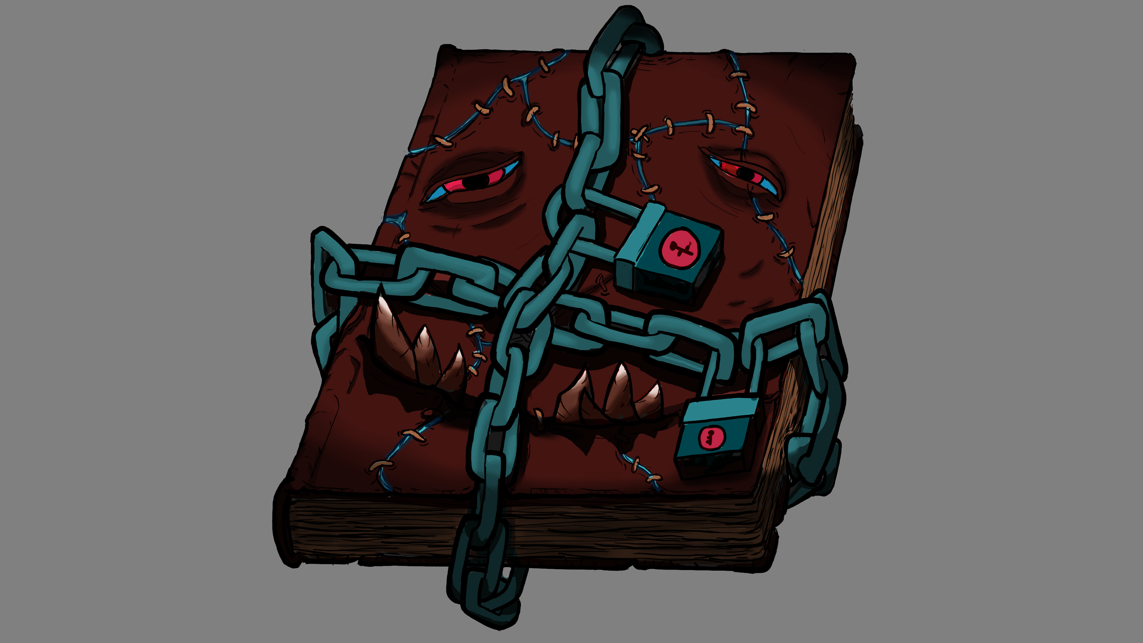
Applying color to values
The very first assignment in the course was to create a demonic book based off of provided example. While it felt like an immediate jump into the deep end of art, especially given that this is a beginner's course, this assignment that lightly covered the basics of line art, values, lighting, and color set a solid foundation for the future assignments to come. It also kicked my butt into gear a bit, seeing how serious the coursework was compared to the free videos you find on youtube. The feedback and criticism from my mentor Humza Khan was indispensable here and in the upcoming assignments as it really showed me how much there was for me to learn, and more importantly, how much I myself could be capable of.

Initial lineart that would set the basis for the costume
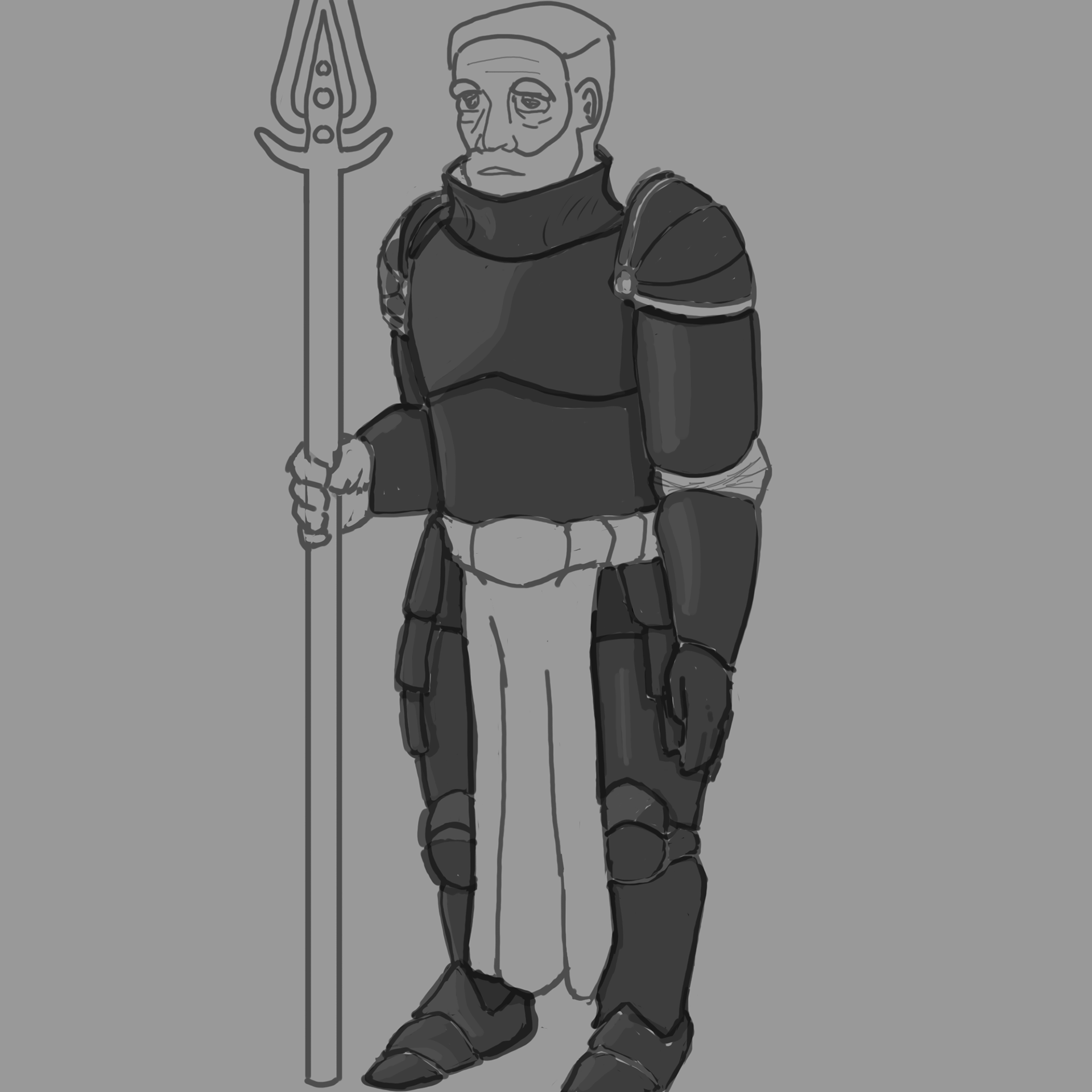
Exploration with an armored warrior
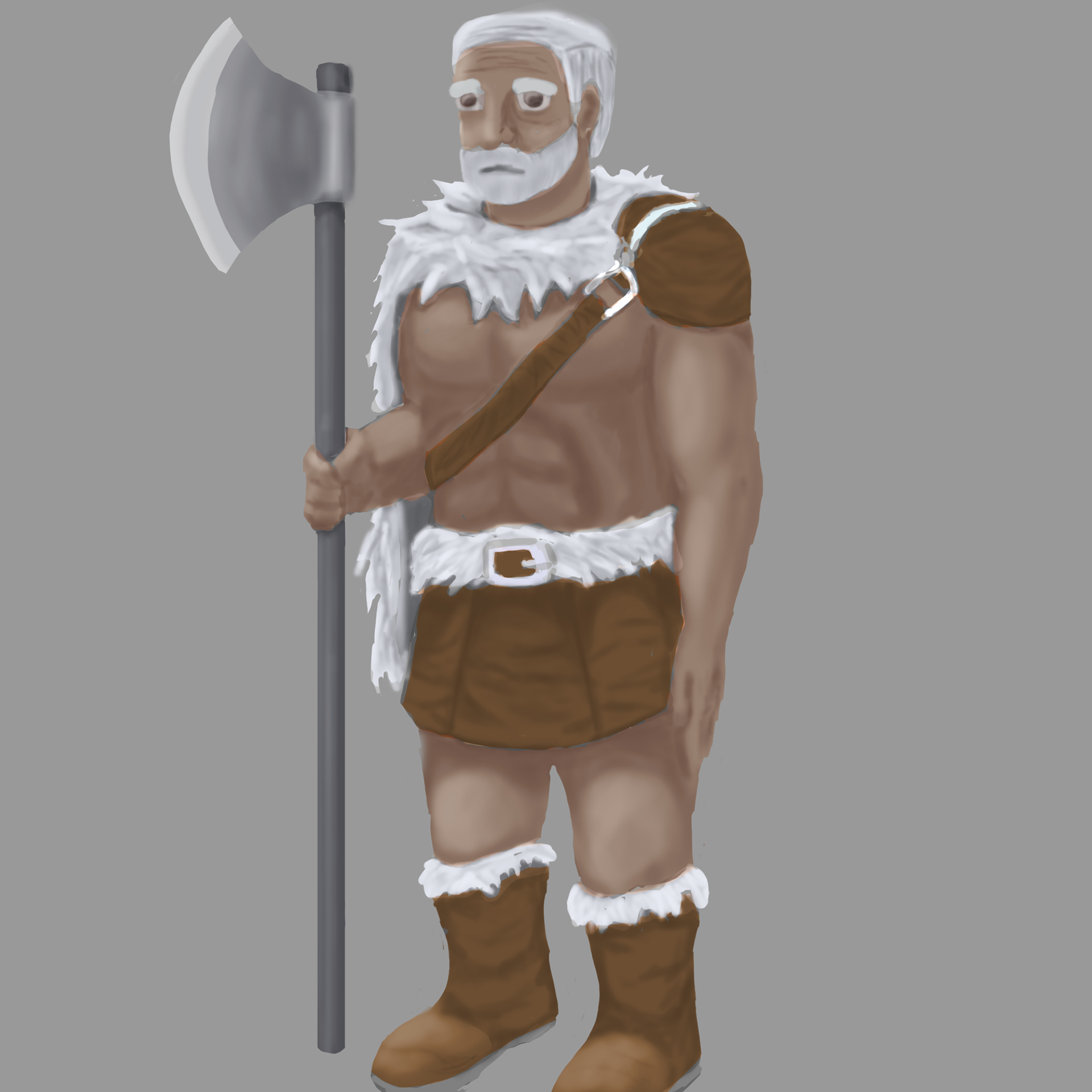
Needed to make use of something more fantasy and able to showcase anatomy, hence the difference in design from the pervious
Oh man, I knew looking back at older work would hurt but here we are anyways. This was a brief study in anatomy and costume design, focused on creating fantasy warrior as well as exploring a few different ideas for them. While I enjoyed making the armor, my mentor reminded me that the focus was on understanding the relationship between the costume and anatomy. Ended up reworking and rendering out the final costume as you can see up there.
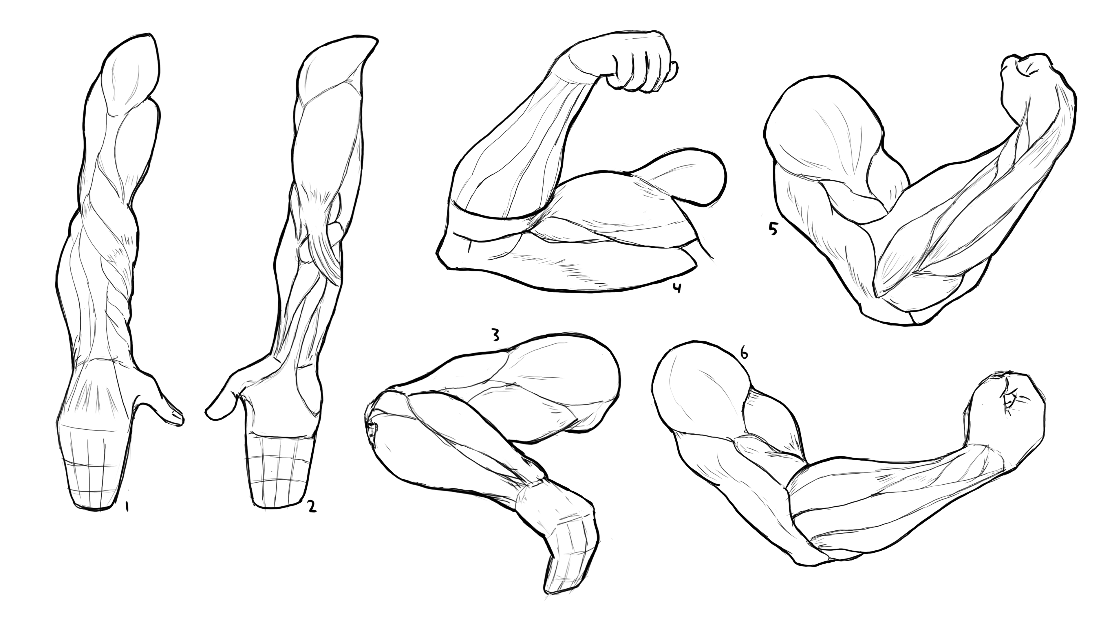
Anatomy study of the arm in various positions with a provided ref

Conceptualizing a fungal infection in 3 stages, from little change to severe
This assignment, if it wasn't obvious enough, was a deeper dive into anatomy. Using a provided reference sheet, I explored and learned quite a lot about the makeup of human arms. It was honestly really fun, creating the arm sketches and even more so when we moved onto creating a concept from them. While they let us choose from several prompts, I went with a fungal mutation where we had to conceptualize multiple stages of an infection, building off of the arm framework we created ourselves.
Also, apologies for the gore, though it's a bit late since the caption is under the image anyways hehe.

Ideation/Thumbnail stage, exploring as many iterations as my little brain could muster
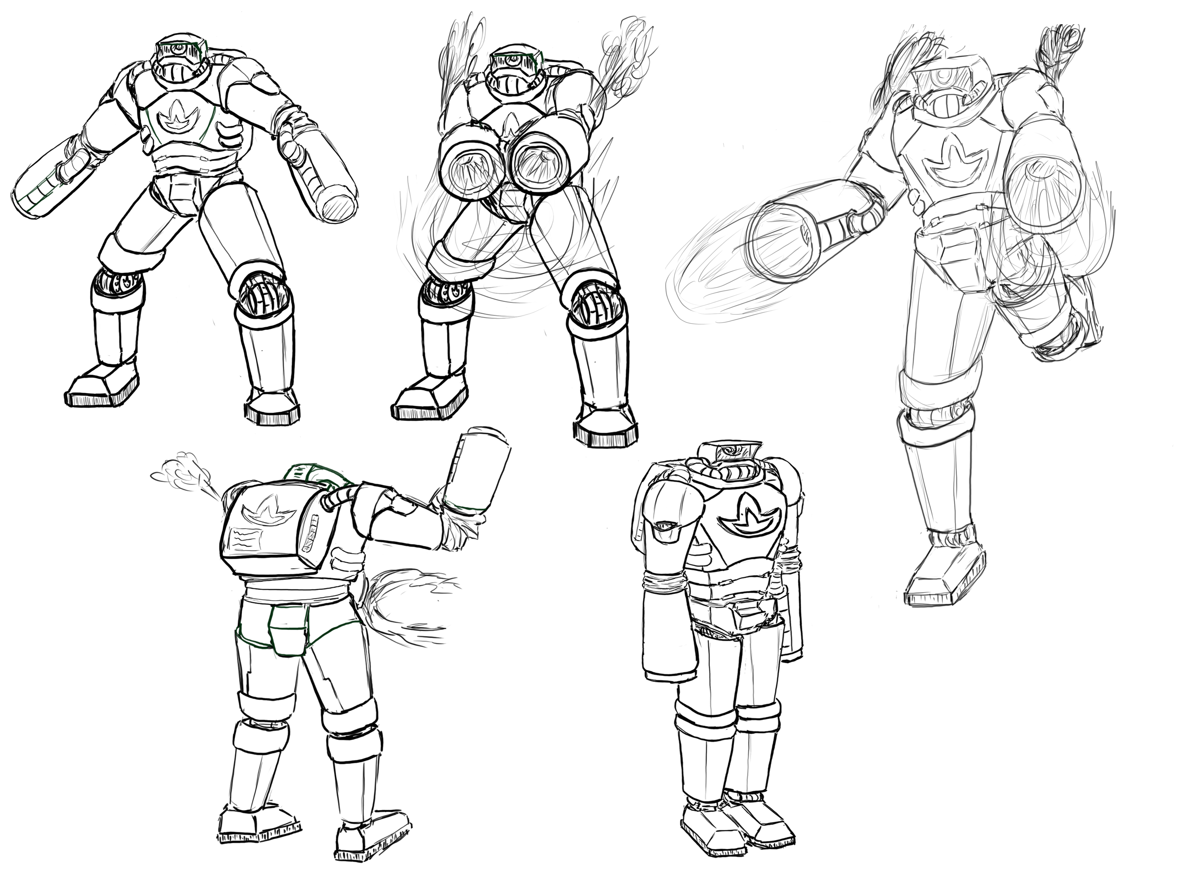
Posing and deciding on the details of the android for final iteration
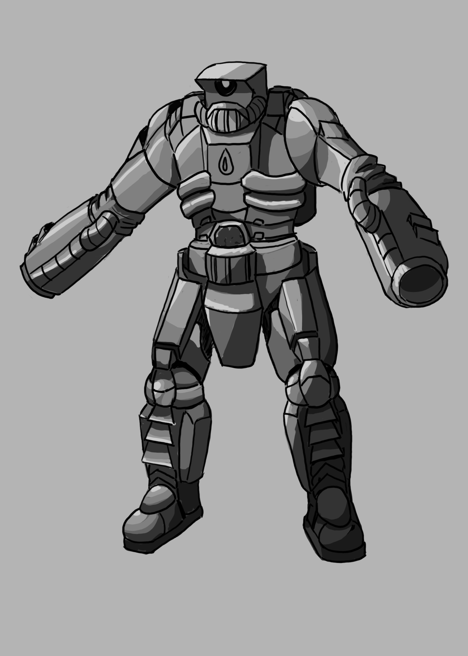
Lineart/value mapping
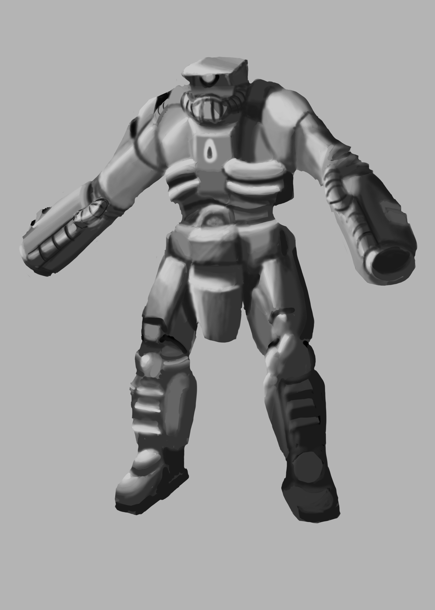
Rendering out the image to be polished further
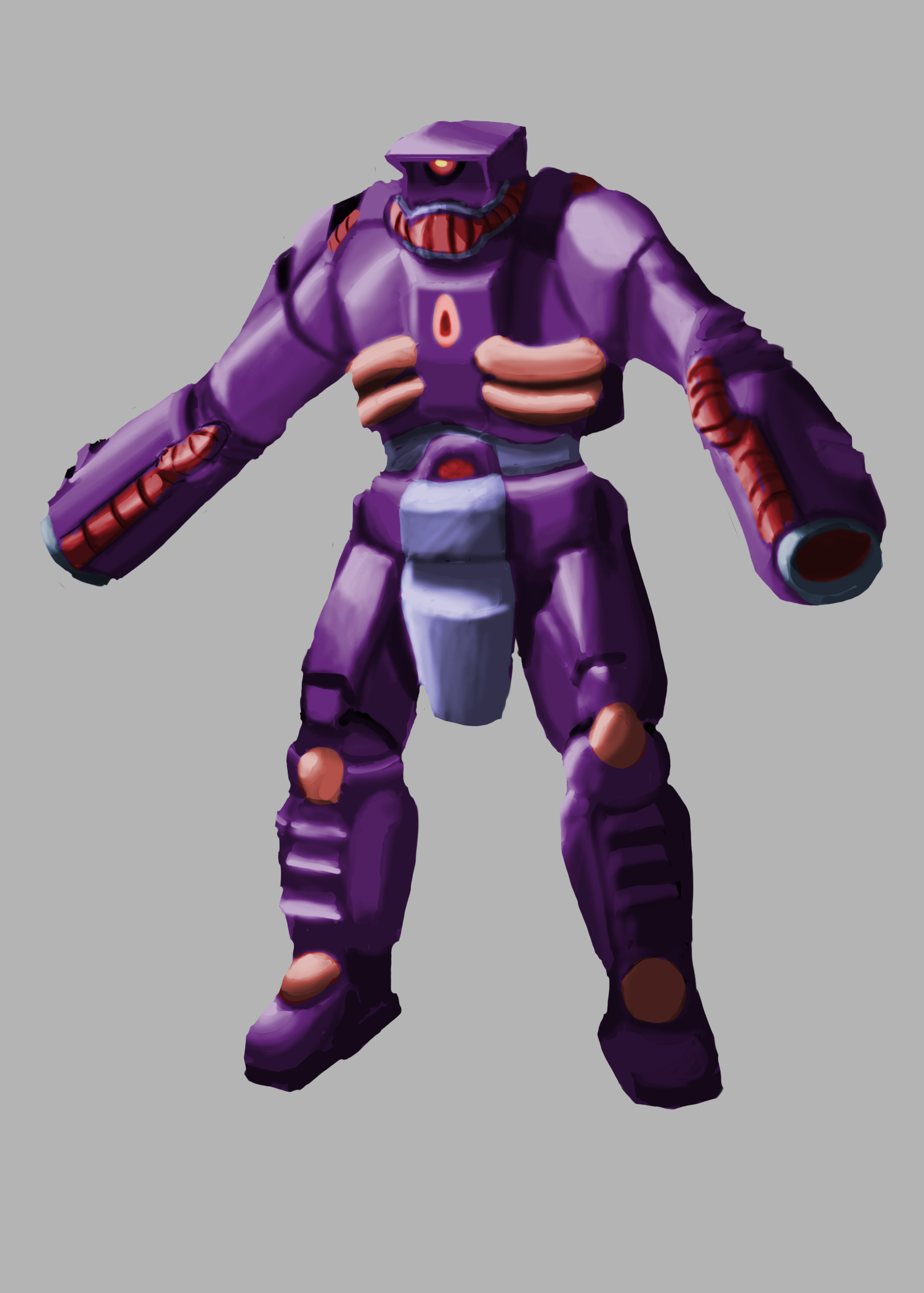
Purple palette
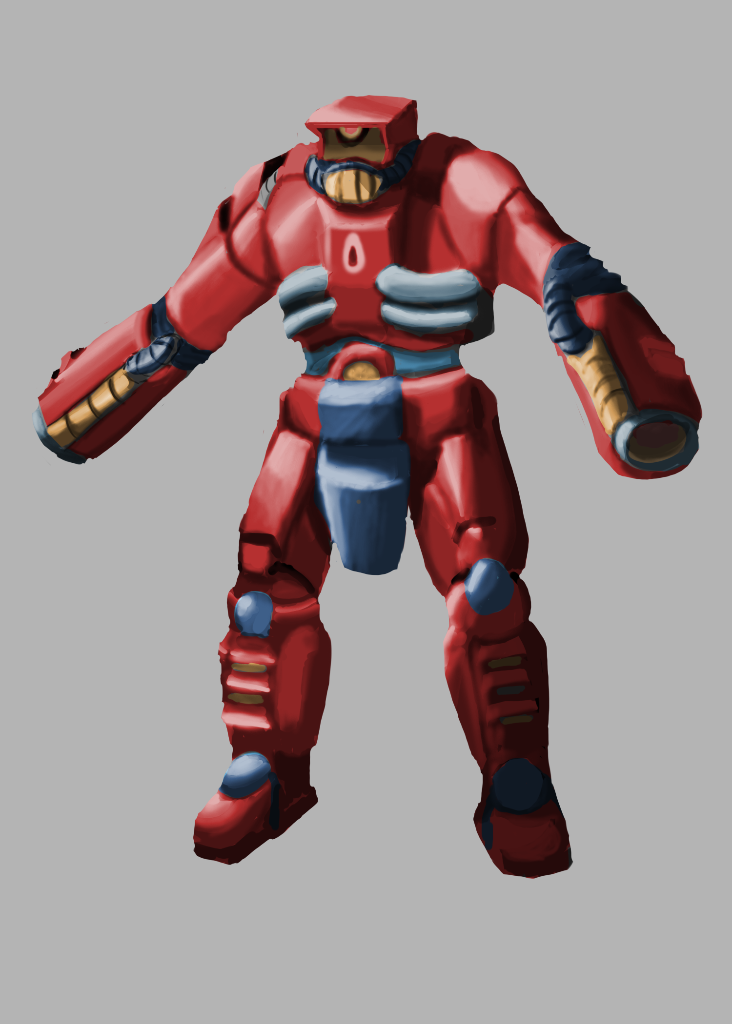
Red palette
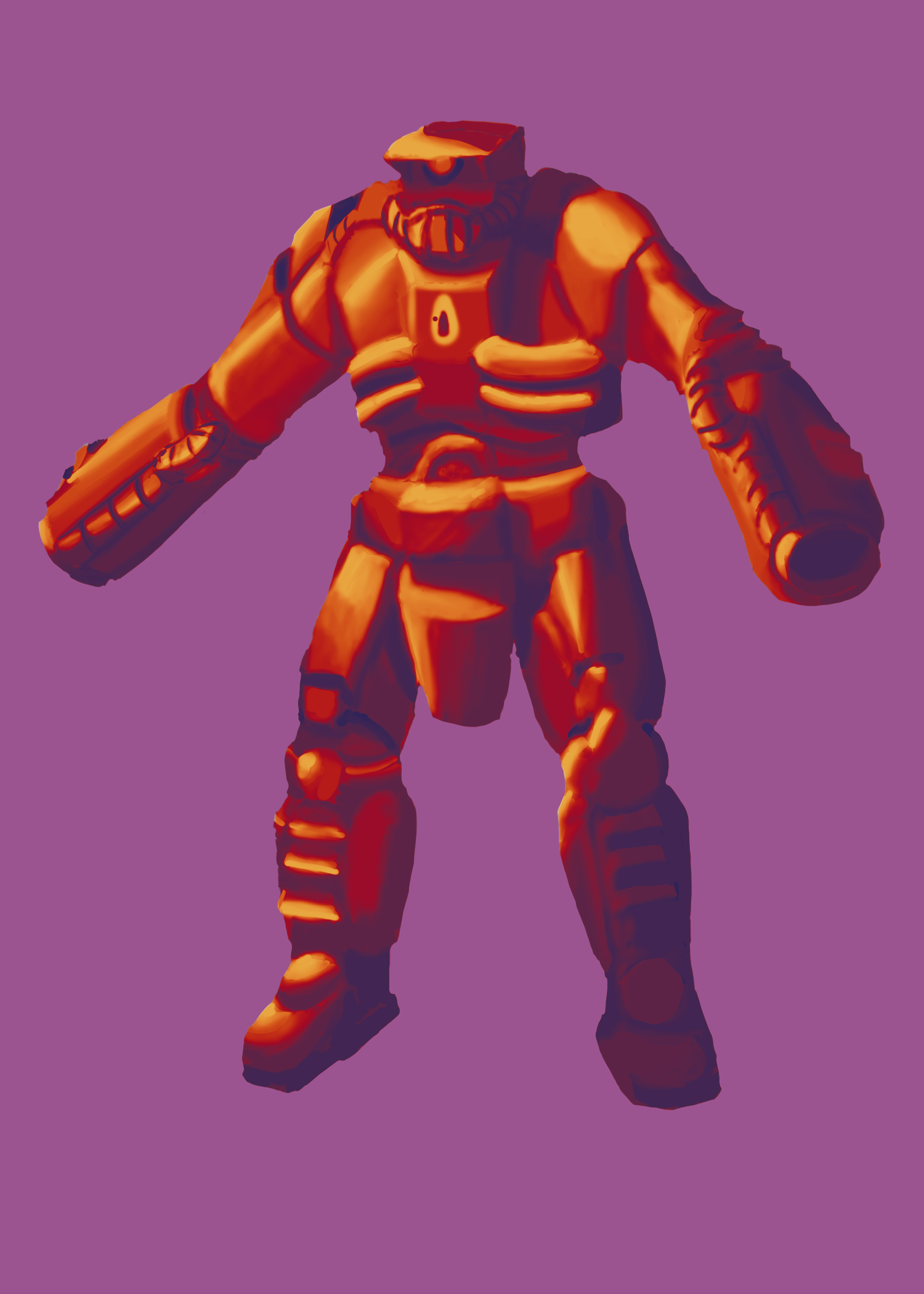
First time using a gradient map with a warm paletter
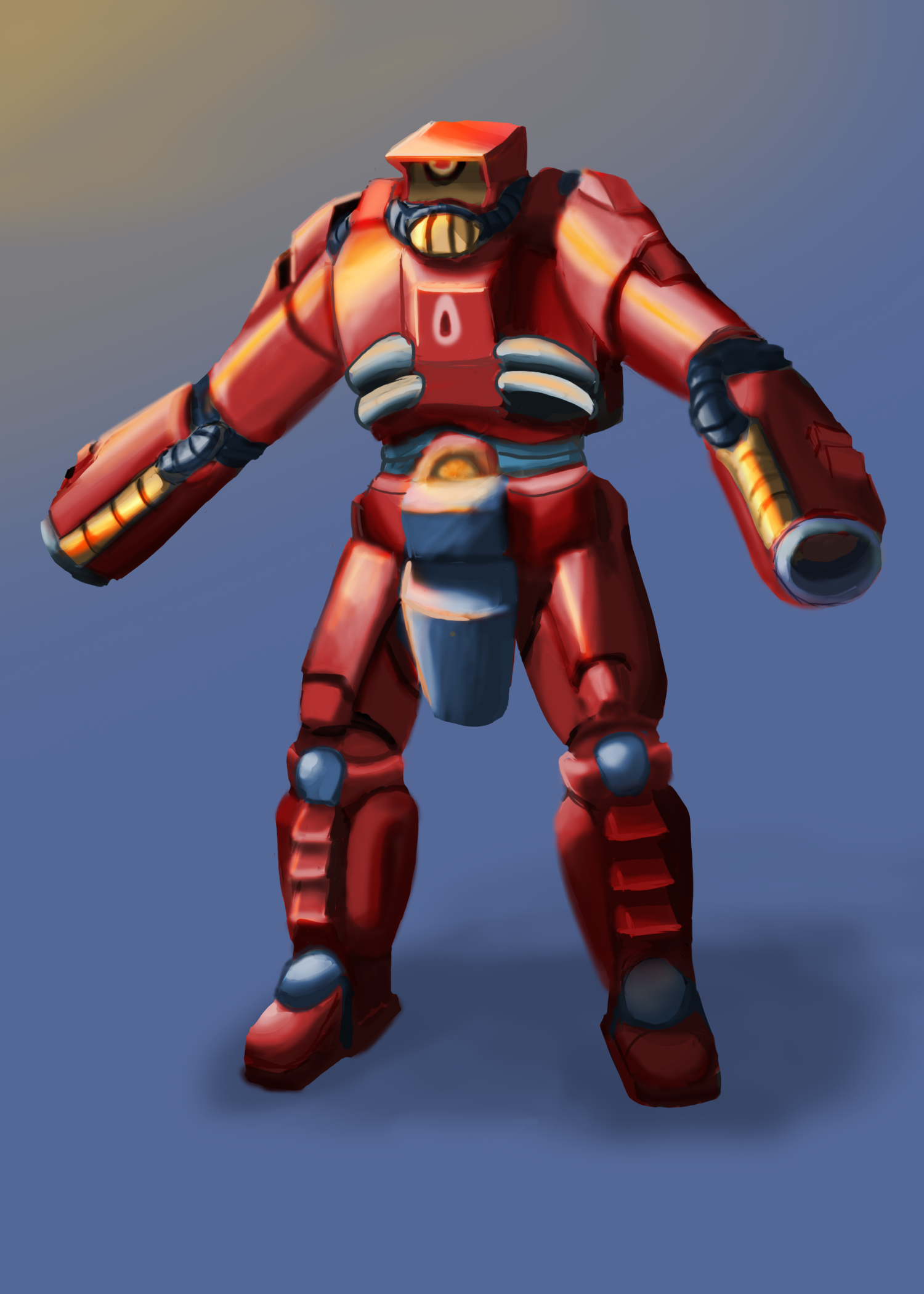
Final polish/adding in a clear light source
As the final assignment of the term, this android ended up taking the span of multiple weeks of feedback and iterations that took everything that we had been learning throughout the term and putting it to use. Looking back on it, its a similar assignment to the earlier demon book, just much more fleshed out.
Starting with the ideation stage where the prompt was to make as many unique android/robot ideas as you could, I finally got a real taste of how difficult and rewarding concept art can be. The first several ideas might be easy to come up with, but after the initial 10, it became harder and harder to create ideas that weren't just minor adjustments to the previous ones. While I managed to eke out 20 total iterations, it took a lot more time than I ever expected. Still, being forced to squeeze as much creative juice out of my brain as I could was quite fun.
Following up from the thumbnail/ideation stage, things became a bit simpler as it was narrowed to taking the ideas that I liked most from before and putting them together into a singular cohesive idea. This stage was for exploring the functions and details of the android by putting it into various front/back/side poses. The loose prompt was an android that would be used for military/combat, so I stuck with the idea of an android that used fire as a way to exterminate enemies.
The final leg of this journey was an exploration in line art -> value -> full render -> color exploration -> final. During the color exploration phase, I had to attempt making use of multiple palettes as well as methods of coloring. While the simple purple/red was done with an overlay method, the heavily saturated and colorful one was an attempt at using gradient maps for the first time. It left a lot to be desired, but that's why I'm practicing.

Initial value/sketch that sets the framework for the piece
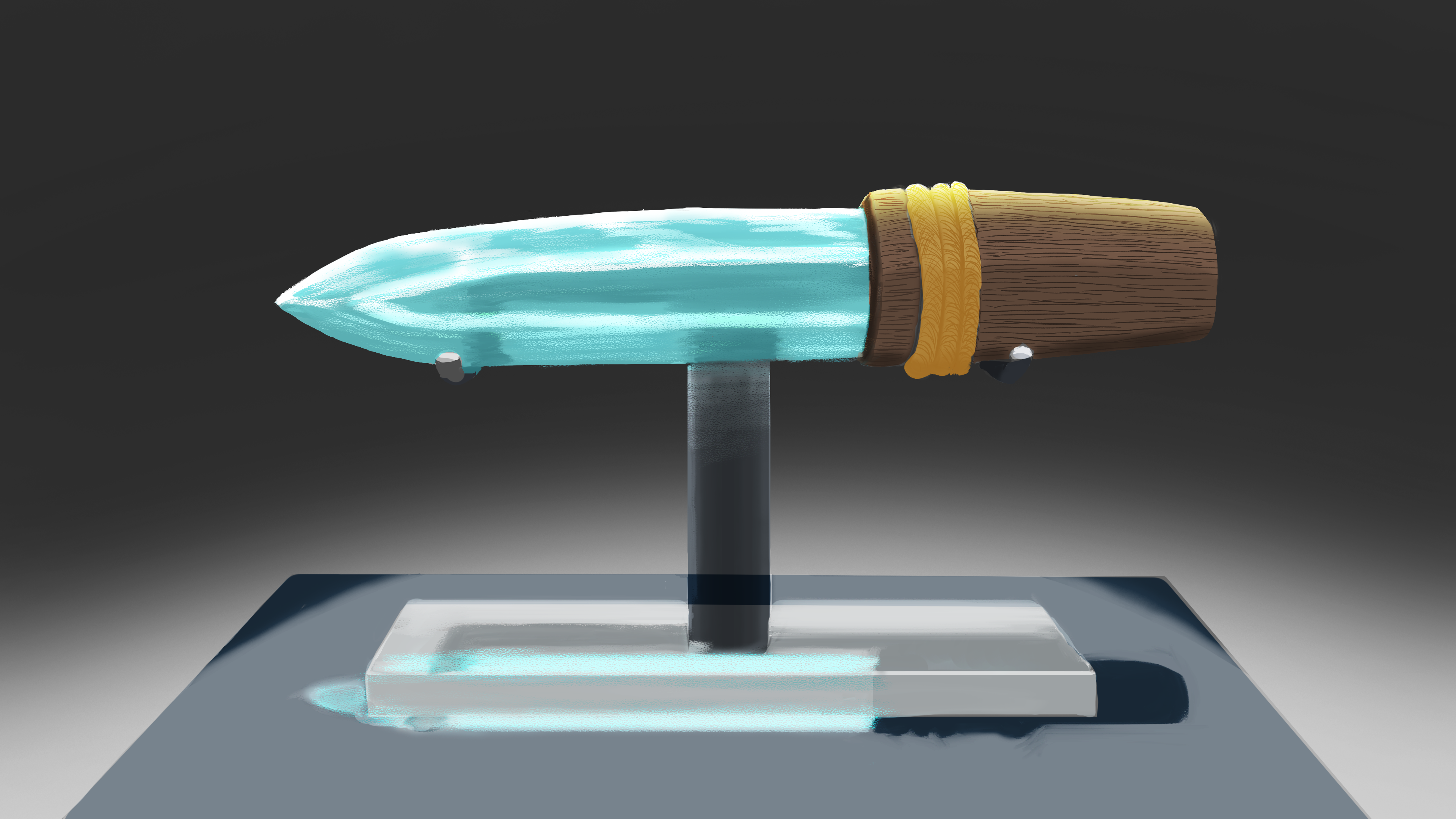
Initial color/render, with a focus on material properties

After the first round of feedback, I learned to pay more attention to the little details that pushed my piece from flat to feeling more realistic
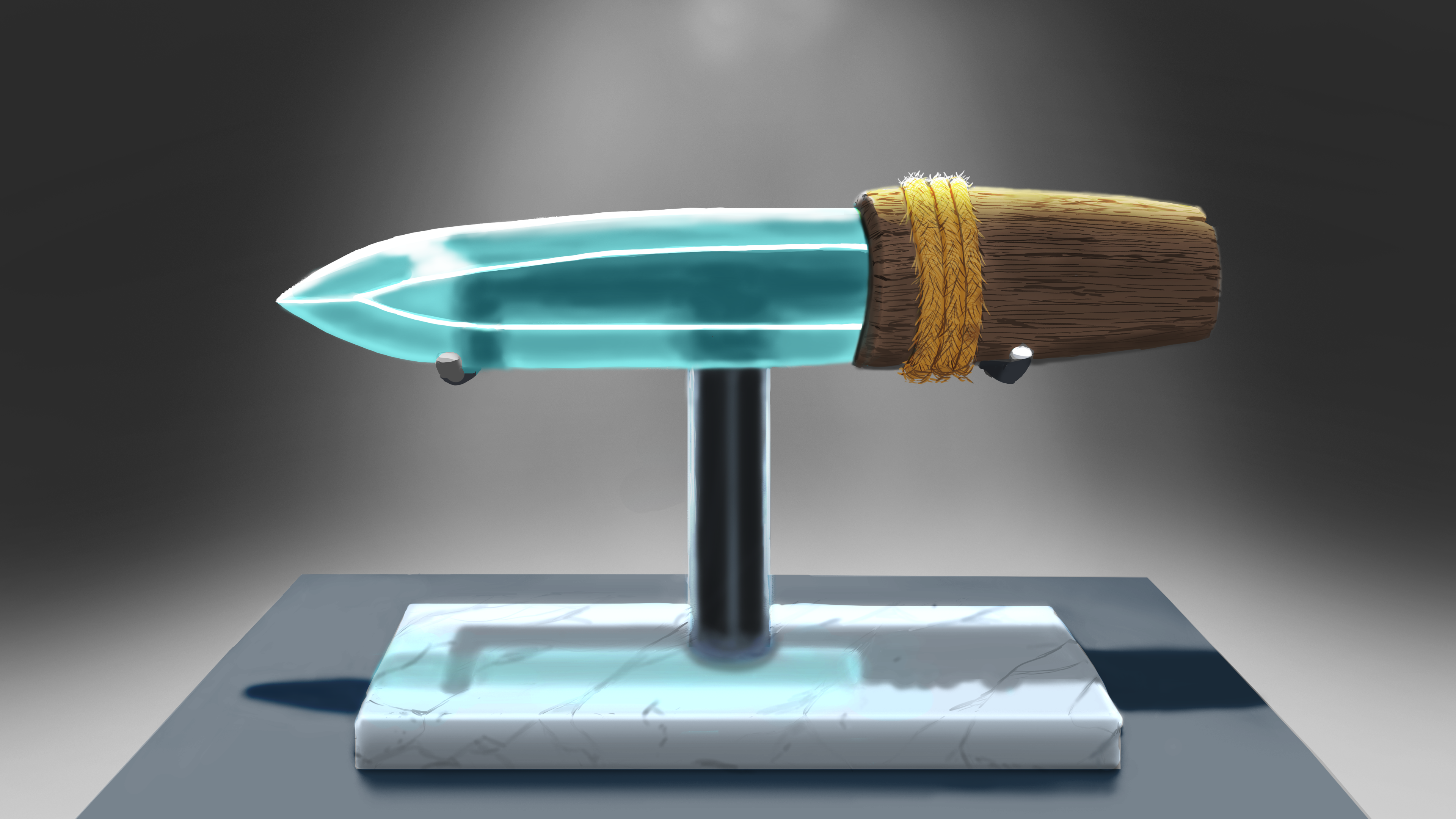
After another round of feedback, I pushed even further into creating realistic contrasts and the properties of glass, wood, metal, and stone
With the start of a new term, they once again threw me straight into the deep end of art. The prompt here was to make a glass knife that would be displayed in a museum/gallery with an emphasis on working with light and material properties such as reflectiveness, opacity, shadows, etc etc. Without the guidance of my new mentor Joel Carpenter, I don't think I ever would have been able to create the final product that you see here.
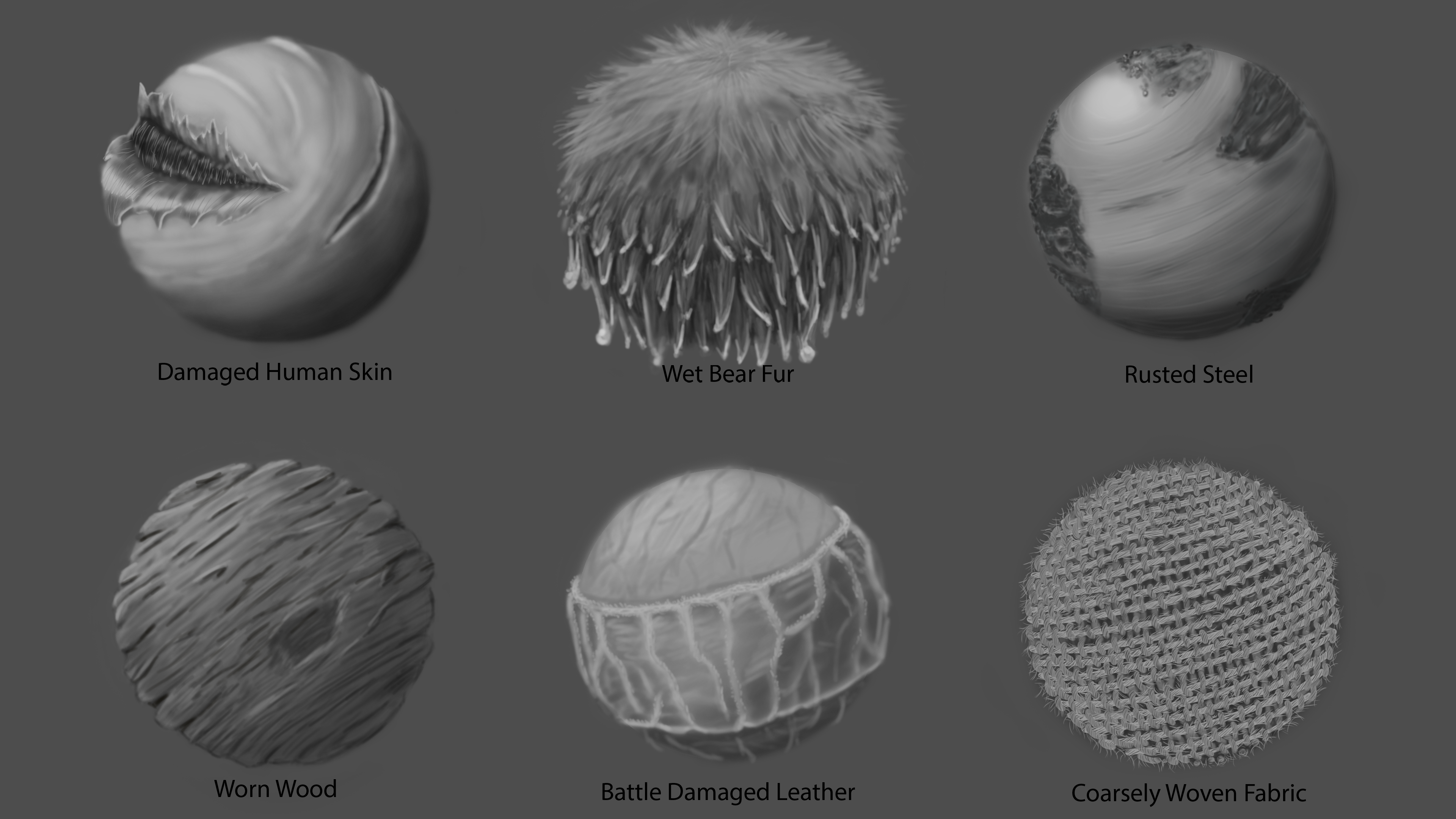
Material Wedges value stage
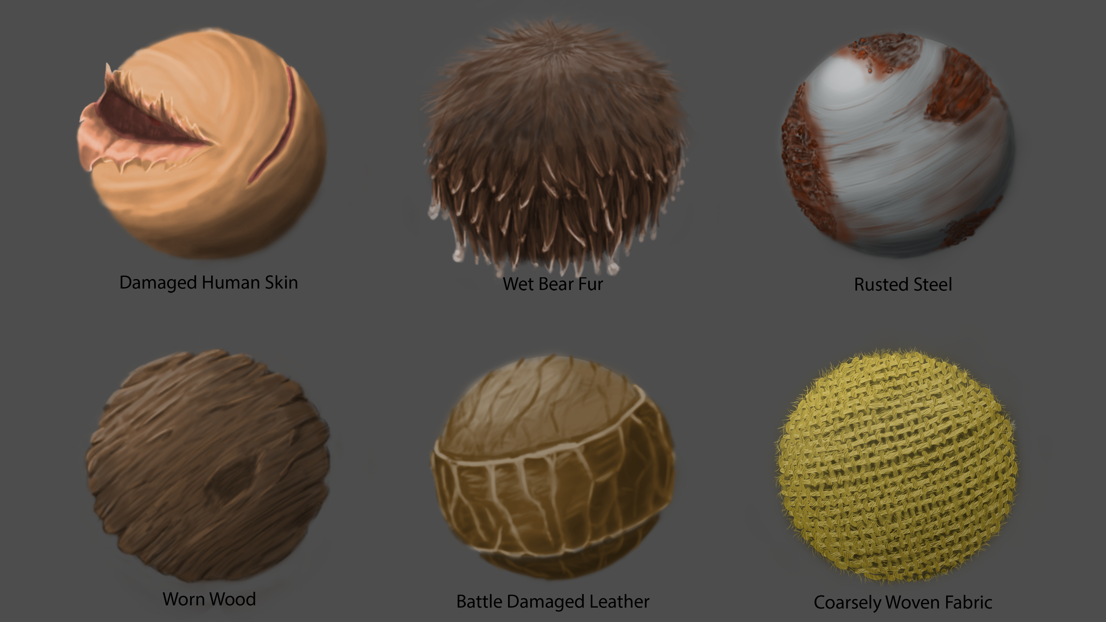
Material wedges color/render
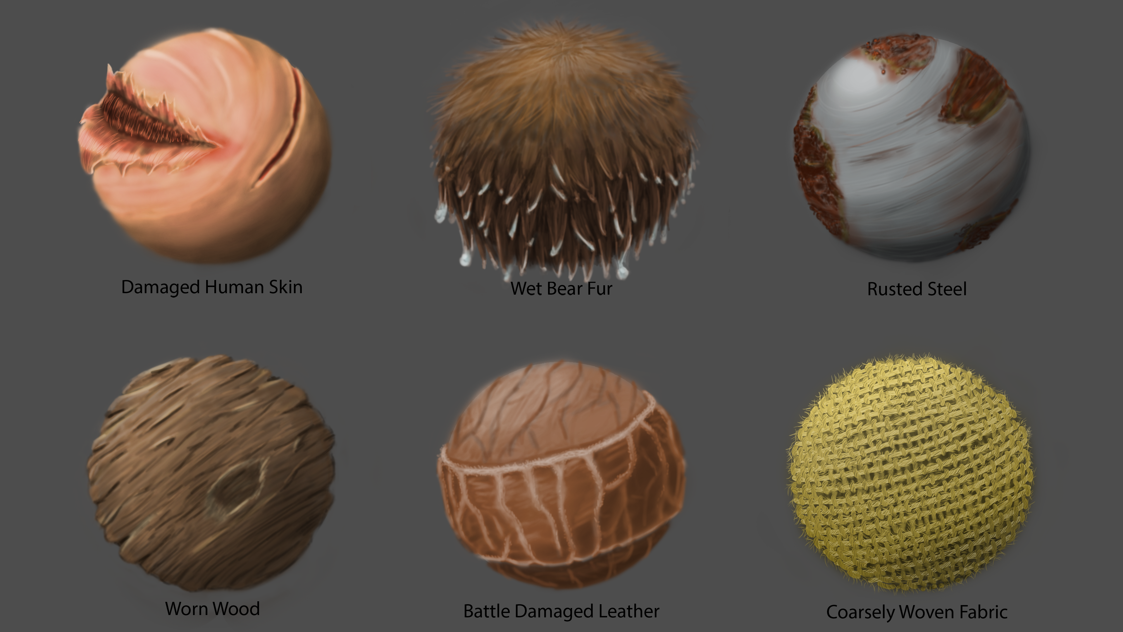
Material wedges final polish
Another first for me was a look at material wedges. After working on the previous piece with the glass knife, a deeper exploration into material properties made a lot of sense. While I have seen these material balls done before in game design concepts, actually working on some myself was a great experience. It made me realize just how little I understood materials in general and learning to observe and note the differences between materials improved my art drastically once more. The subtle application of light is also a big factor that really makes a picture pop in ways I never would have realized on my own.

Initial value setup

Adding in color on top of the values from earlier

After feedback from mentor, added polish, details, and a light scheme that brough out a more cohesive image
Building on the previous lesson, I was tasked to create a bear riding warrior and to make use of the materials wedges I had built beforehand. While not every material got the spotlight, like the coarse rope and leather, having an understanding of how fur looked while wet was actually a huge deal in adding authenticity to the bear. It really opened my eyes to the importance of studying a material that you plan on using in an art piece.
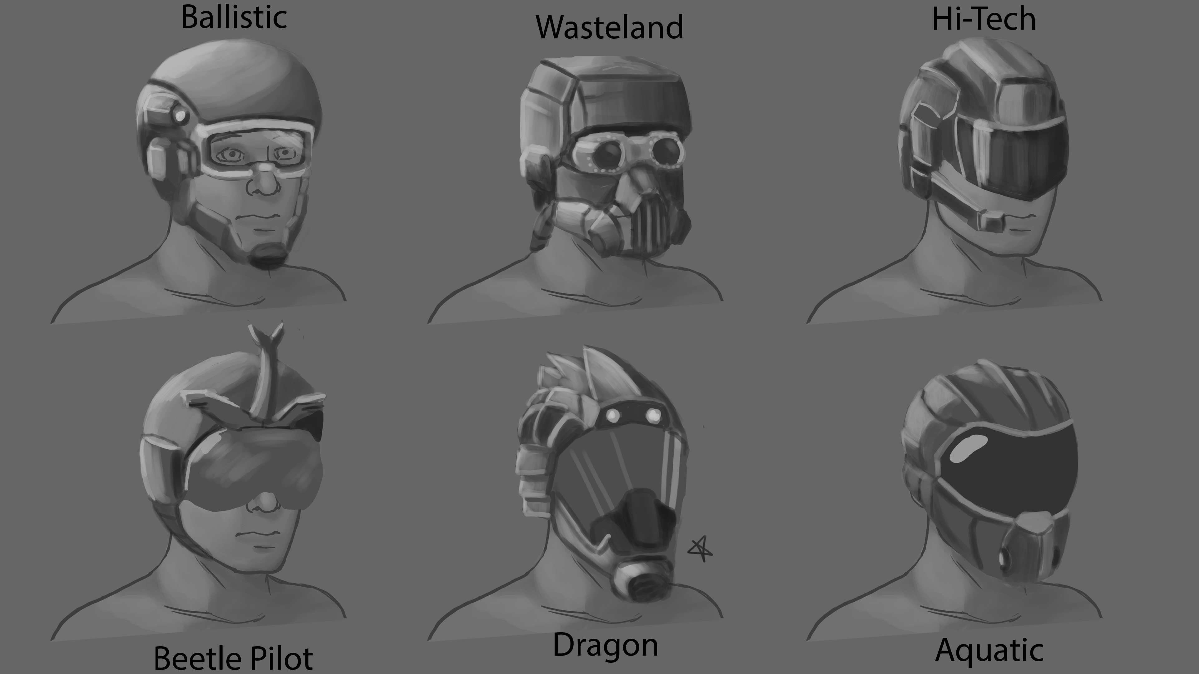
Initial ideation/value setup
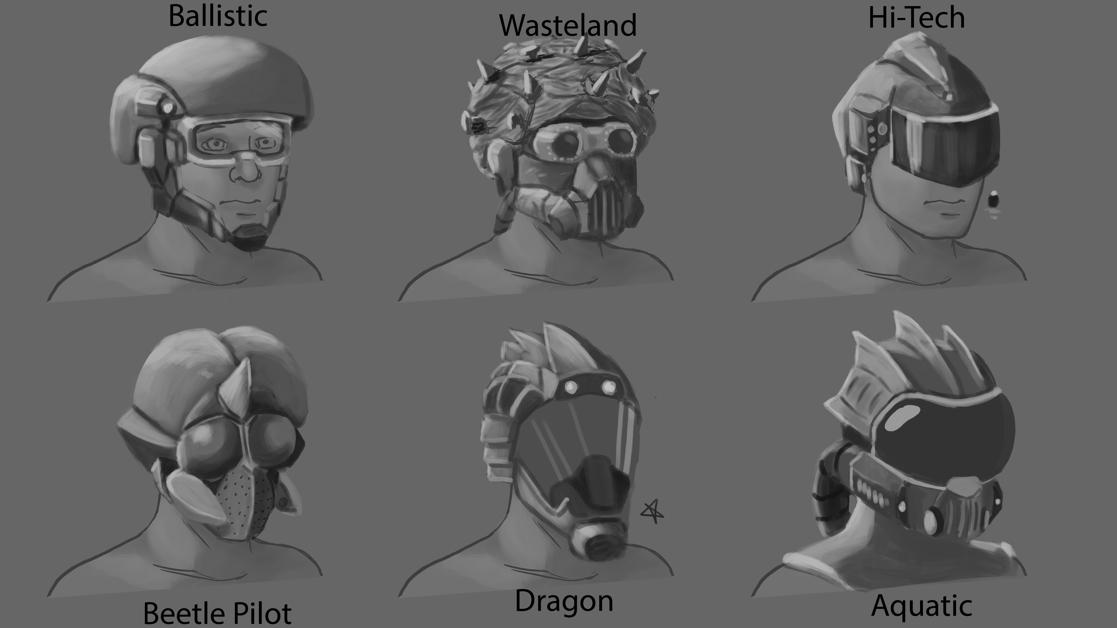
Using feedback, I pushed the ideas a little further to make each one more distinct

Using the value base from earlier, I used a rather simple palette and ended up with this stylized look

Final polish where I was reminded to make use of previous lessons with materials
Similar to the android piece, the prompt here was to explore various kinds of helmets with different themes. While I didn't have to make 20 iterations like before, just these 6 iterations to a higher level of polish was difficult in a whole new way. If you noticed the star next to the dragon helmet, I initially wanted to use that as the main piece going forward, but as I polished things up, I moved over to the aquatic headset instead. It turned out quite well, especially the final rendering of the glass goggles. All that practice with the knife earlier was already showing results.
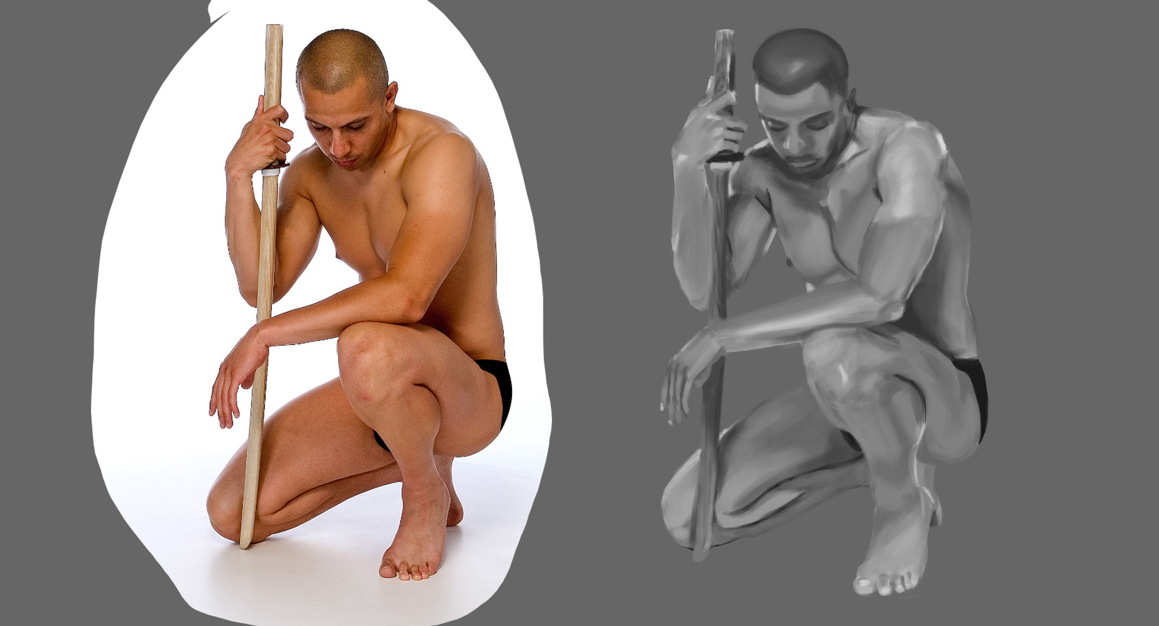
Life Drawing reference on left, value sketch on right
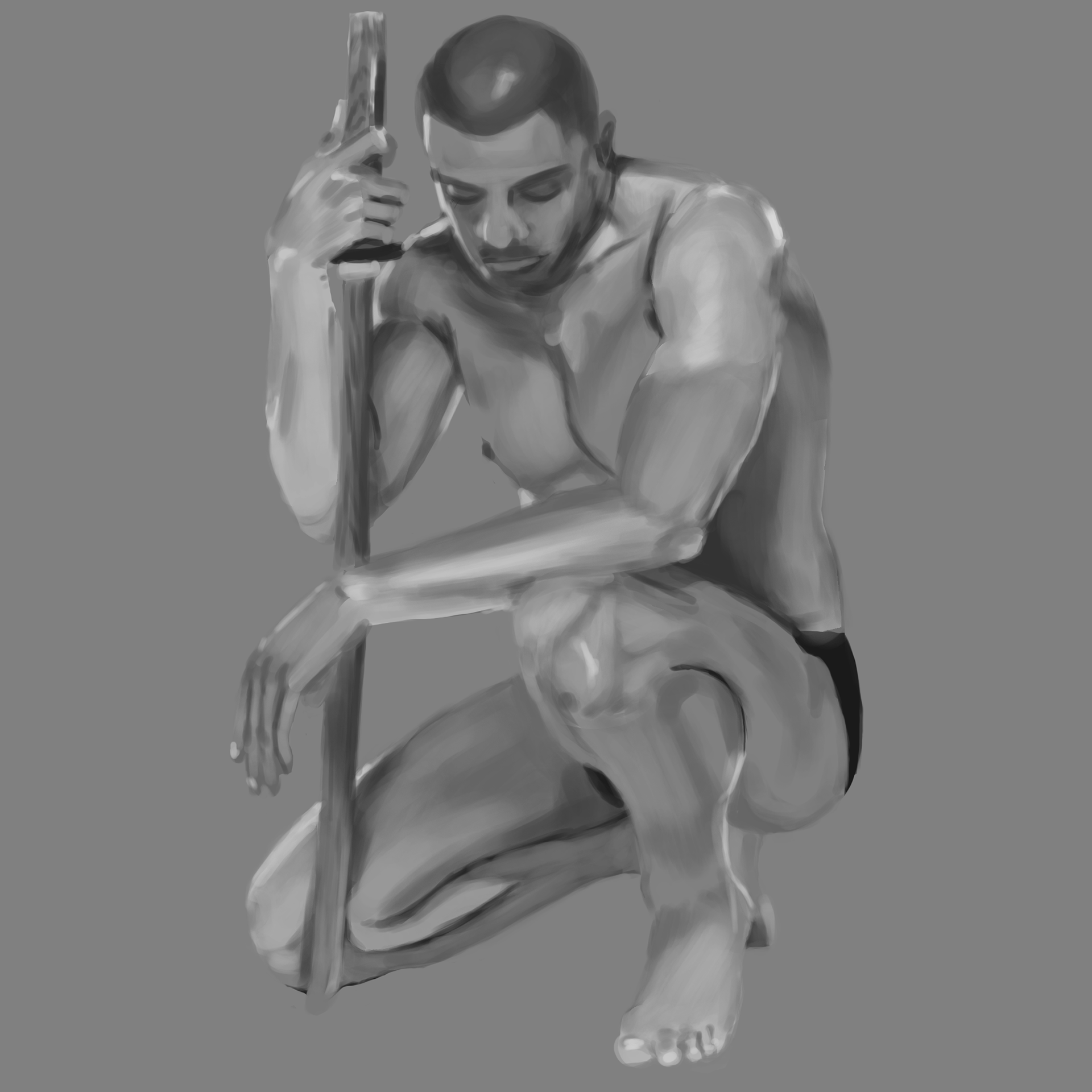
Closer look at value ref after feedback
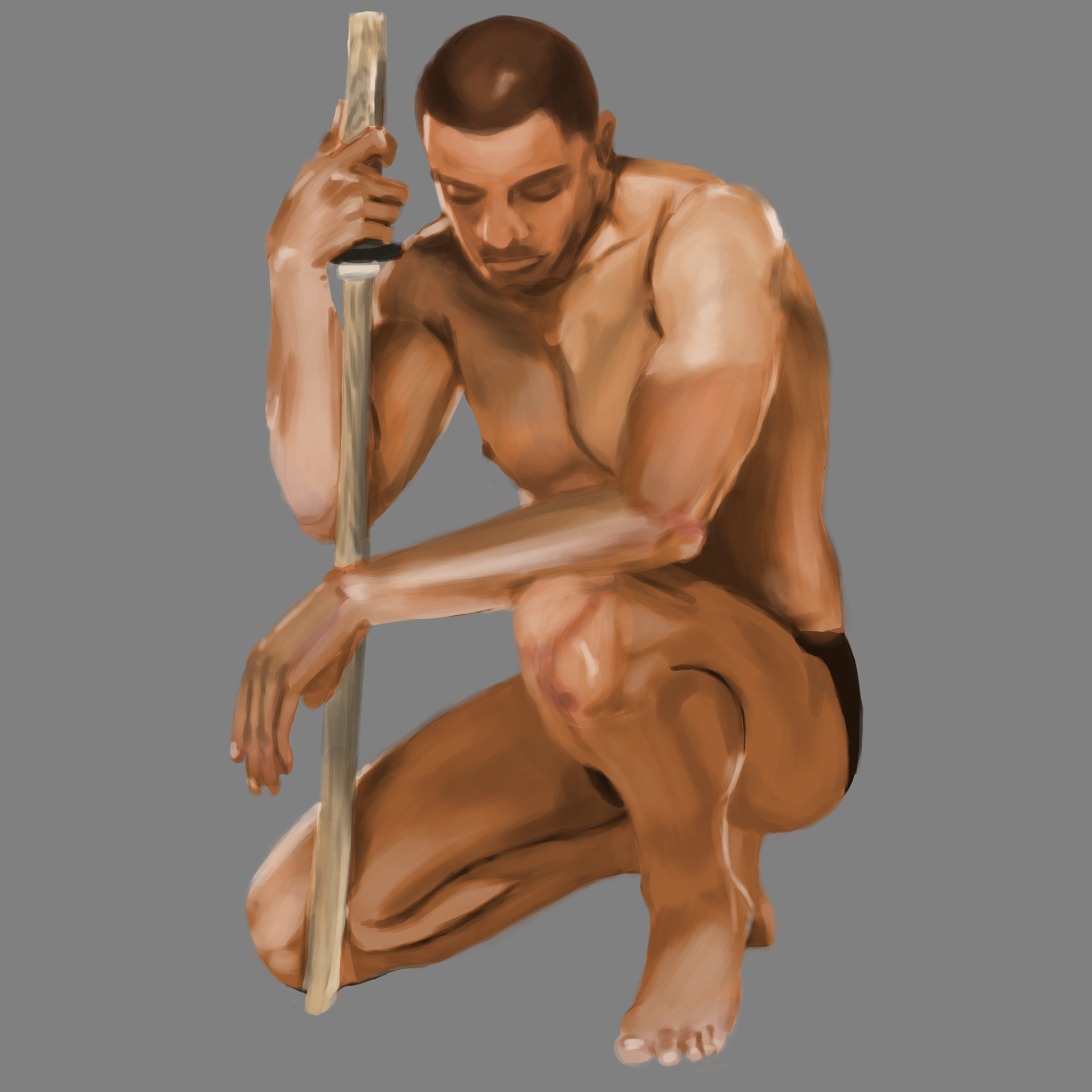
Color render/polish
Honestly, I debated on whether or not I wanted to include this piece as its more of a study than something I designed. However, while not perfect, this study turned out much better than I had expected. I've attempted live studies on my own before, and they never turned out this well, so seeing how well this one ended up was kind of a lightbulb moment for me where I could see my own improvement right in front of me. It really does help a lot to compare your current works with previous ones to mark how far you've come.

Initial idea stage exploring futuristic construction suits
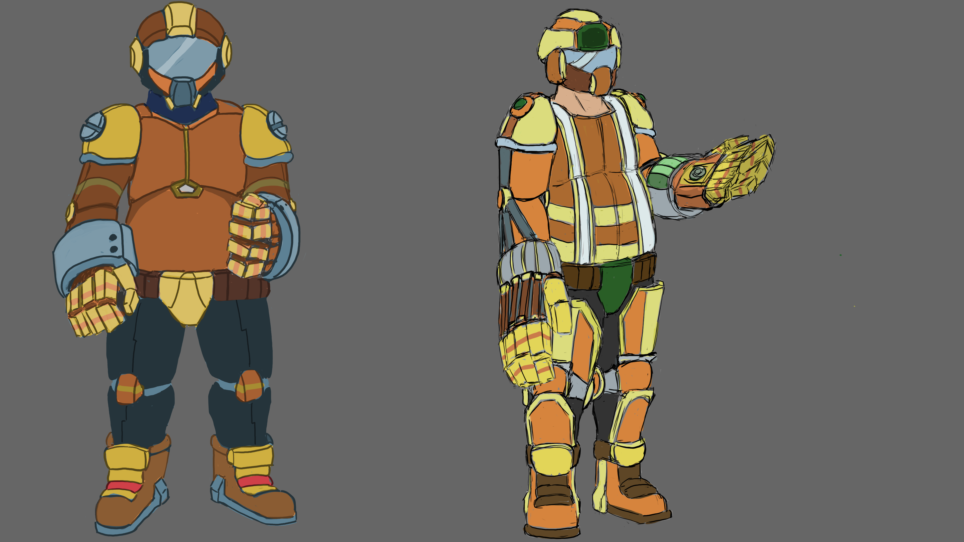
Moving onto color and focusing on 2 similar, but distinct ideas
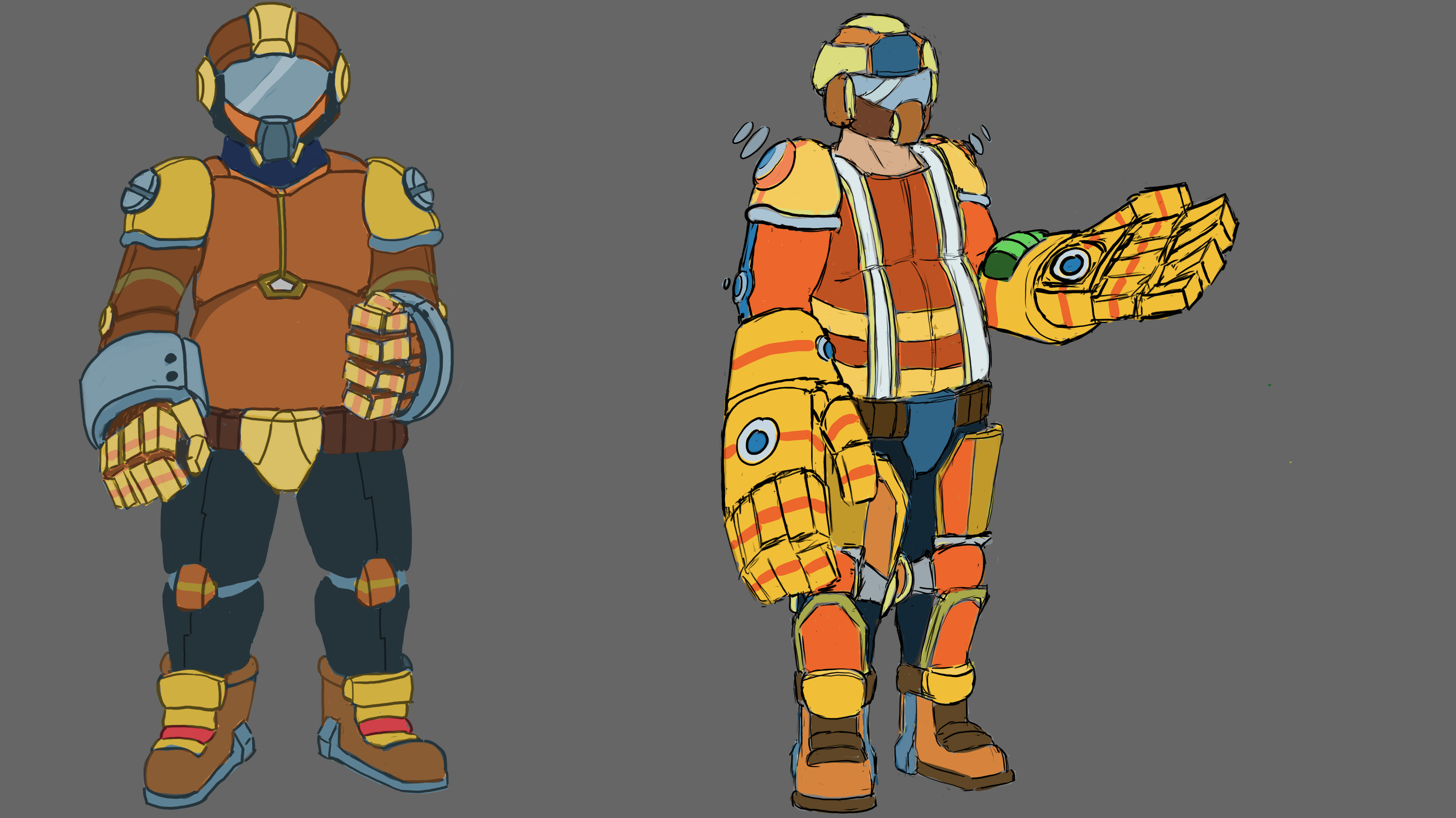
Polish and color adjustments
Aaaaand then we have this. I'll be honest, I really struggled on this design because I was pretty burnt on working with sci-fi/futuristic themes. While the previous study was a nice break from the helmet design, I just couldn't motivate myself to the same degree for this futuristic construction suit. While it isn't exactly terrible, I was reminded of how much more work I needed to put in in terms of color theory and body proportions.

Style study where I explored different uses of shading and line art from realistic to chibi

Focusing on a singular style and testing out different color palettes

Rendering out a final iteration
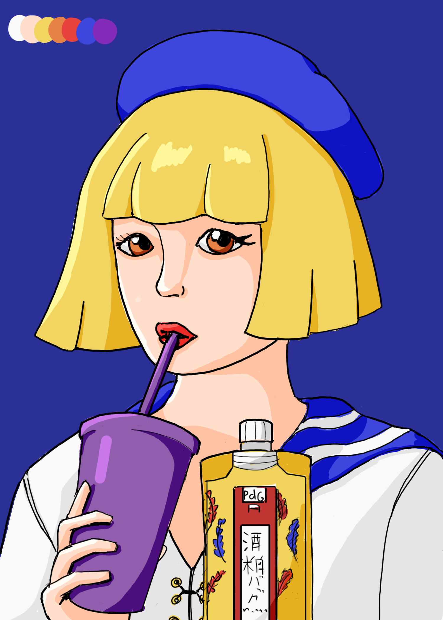
Used a darker background here to see how big of a difference it could make
Thankfully, this piece ended up being a breath of fresh air. While this is also more of a study like the life drawing, exploring different styles and taking note of how certain choices affect the entire look of the piece was something I somewhat knew already, but didn't fully realize the implications of until I tried it for myself. While I'm far from having my own developed style, this study went a long way in helping me realize things about myself, such as what kind of line work I enjoy, how proportionally accurate I like my works, and even the method of shading I like. Not a bad way to end the term.
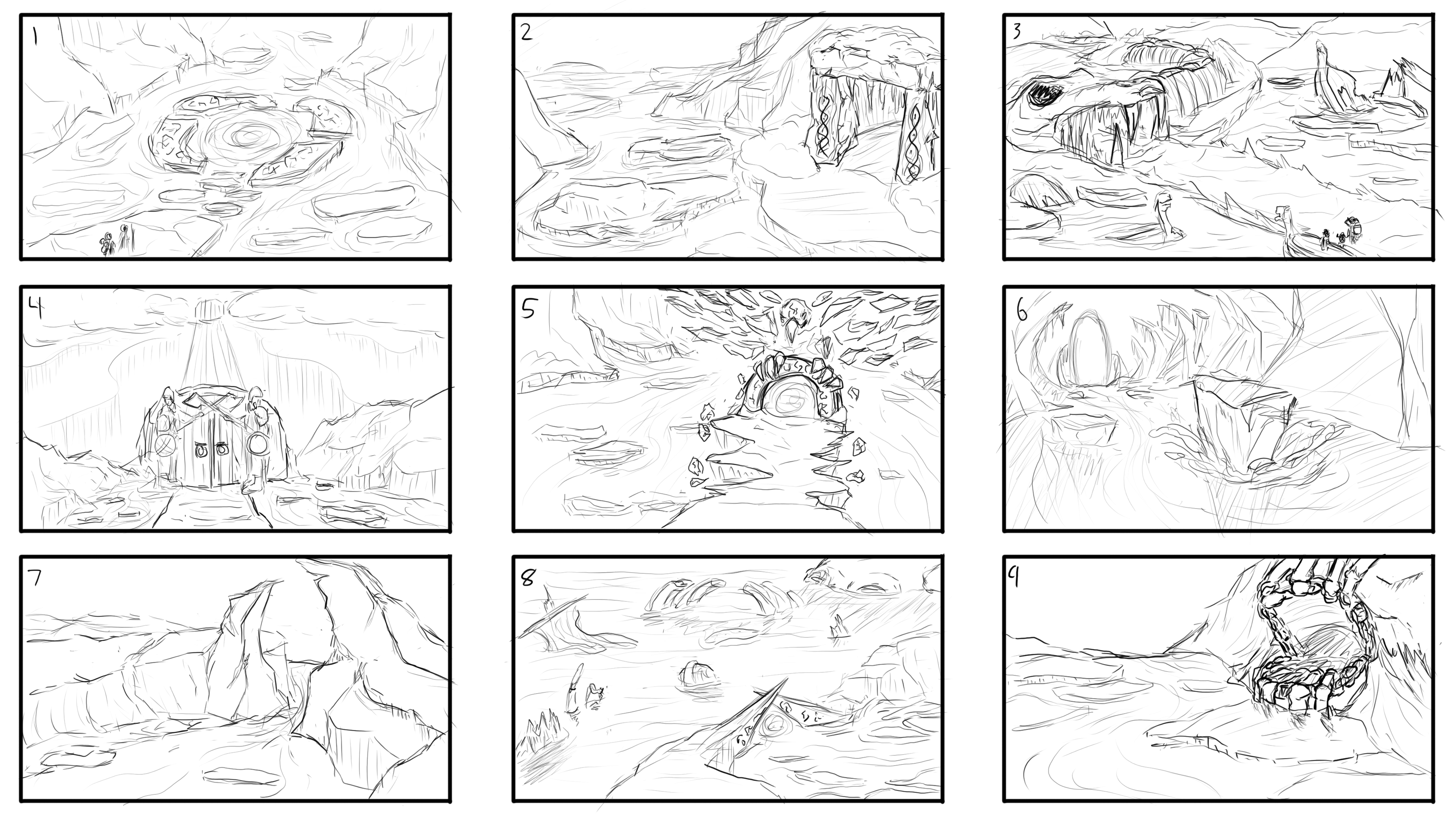
Initial brainstorming/ideation stage, exploring multiple ideas for this gate to the dead

Settling on number 5 from the previous selections and bringing it to full size
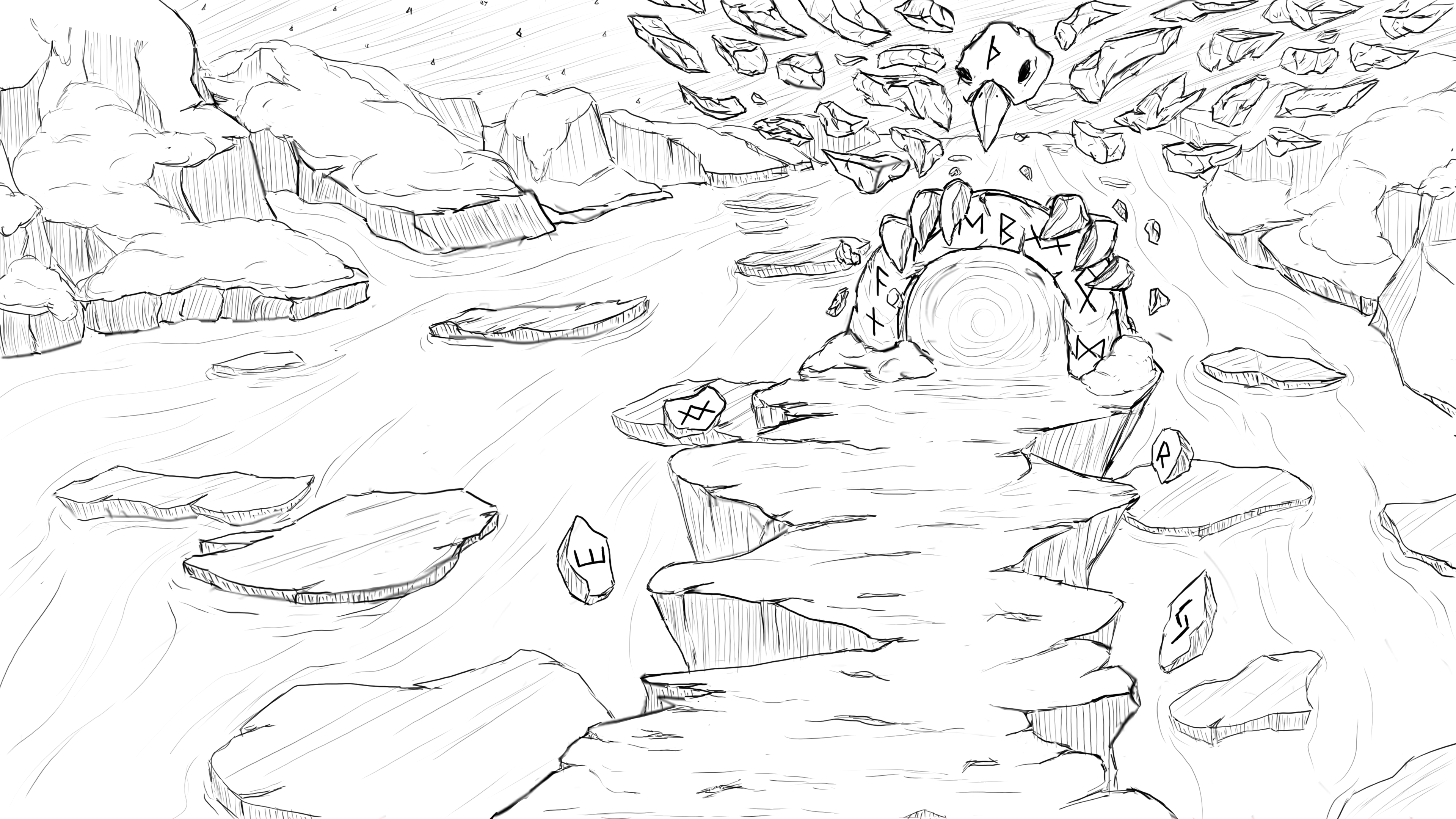
Adjustments made after feedback, bringing down the mountains to build more focus around the gate

Though this didn't make it any further, it was a helpful experiment in changing the perspective of the gate and opening up the background
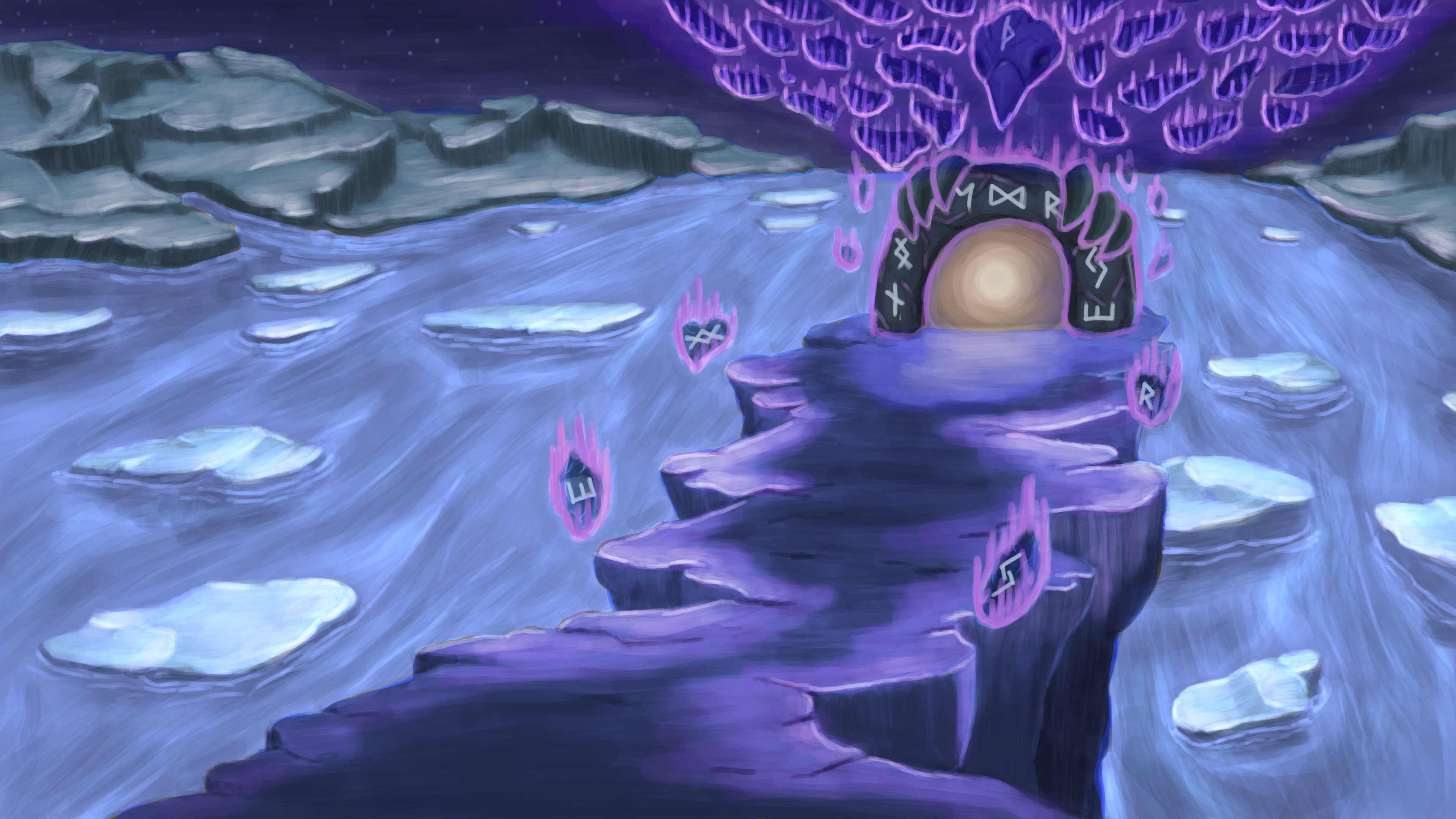
Initial color render, with a focus on a darker theme
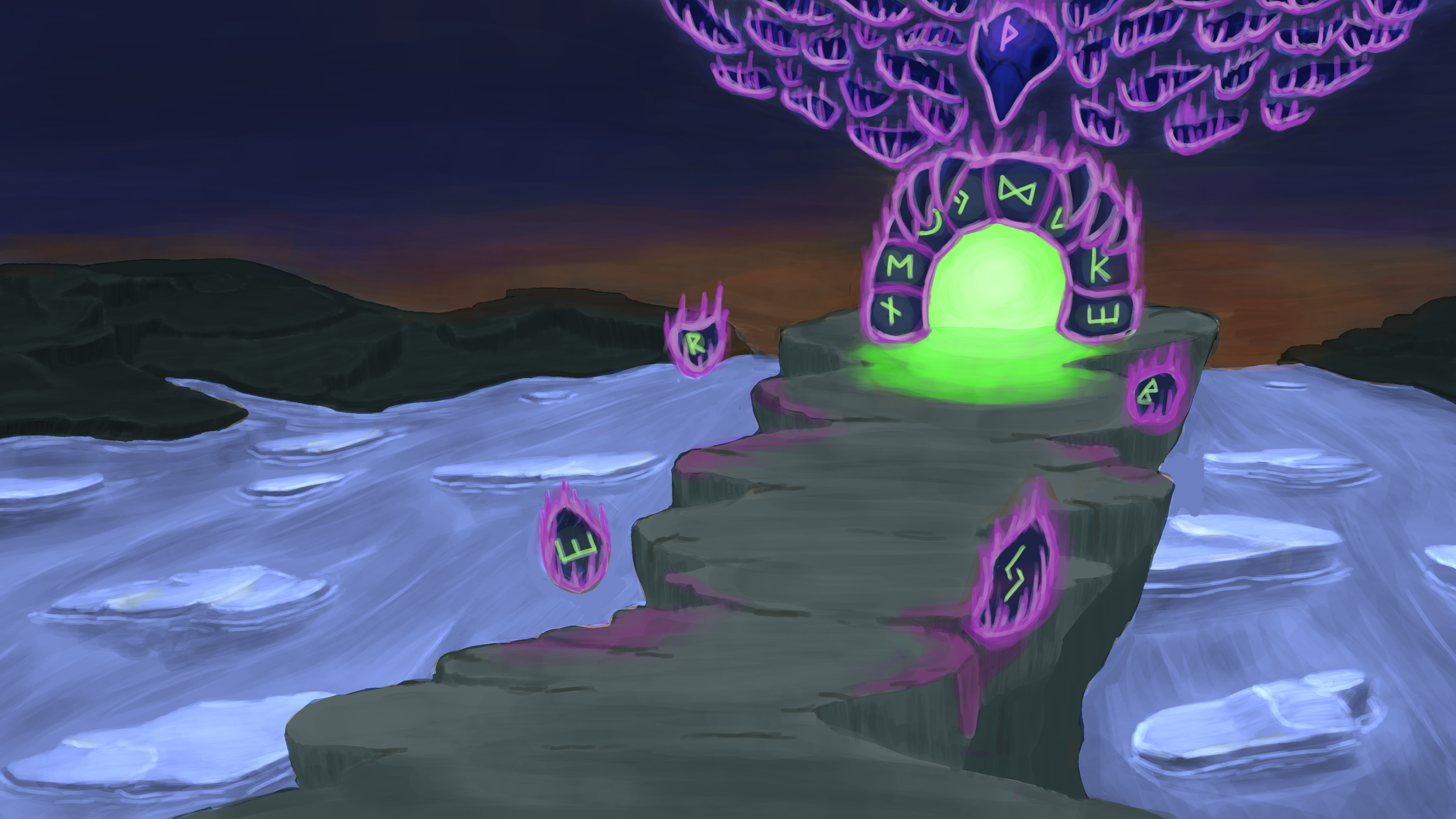
Post feedback adjustments, decided to explore a more contrasted color paletter and warmer background
Nothing like starting a new term with an intensive session of brainstorming and concept work. While I wasn't very familiar with environmental work, I had a great time exploring ideas for this prompt, a Nordic gate to the underworld/dead. We were actually given an example client brief as a prompt for this, so it felt that much more professional to come up with an idea that potential clients might actually ask for. Brainstorming different compositions and structures honestly took quite a while, especially since I did my best to bring it to a certain degree of finish. I would have liked bringing more of these ideas to a full render, but that would be an extensive use of time.
In addition, while I really liked how the line art sketches turned out, I found myself still struggling with using colors that actually looked good and cohesive. The amount of rendering that would be required for the whole piece to look better gave me even more respect for artists who do pieces like these for a living and in much tighter timelines than I could manage. Even with feedback from my mentor, I still couldn't get the rendered pieces to come out how I wanted, but some parts here and there still turned out nice. Definitely a great learning experience overall.
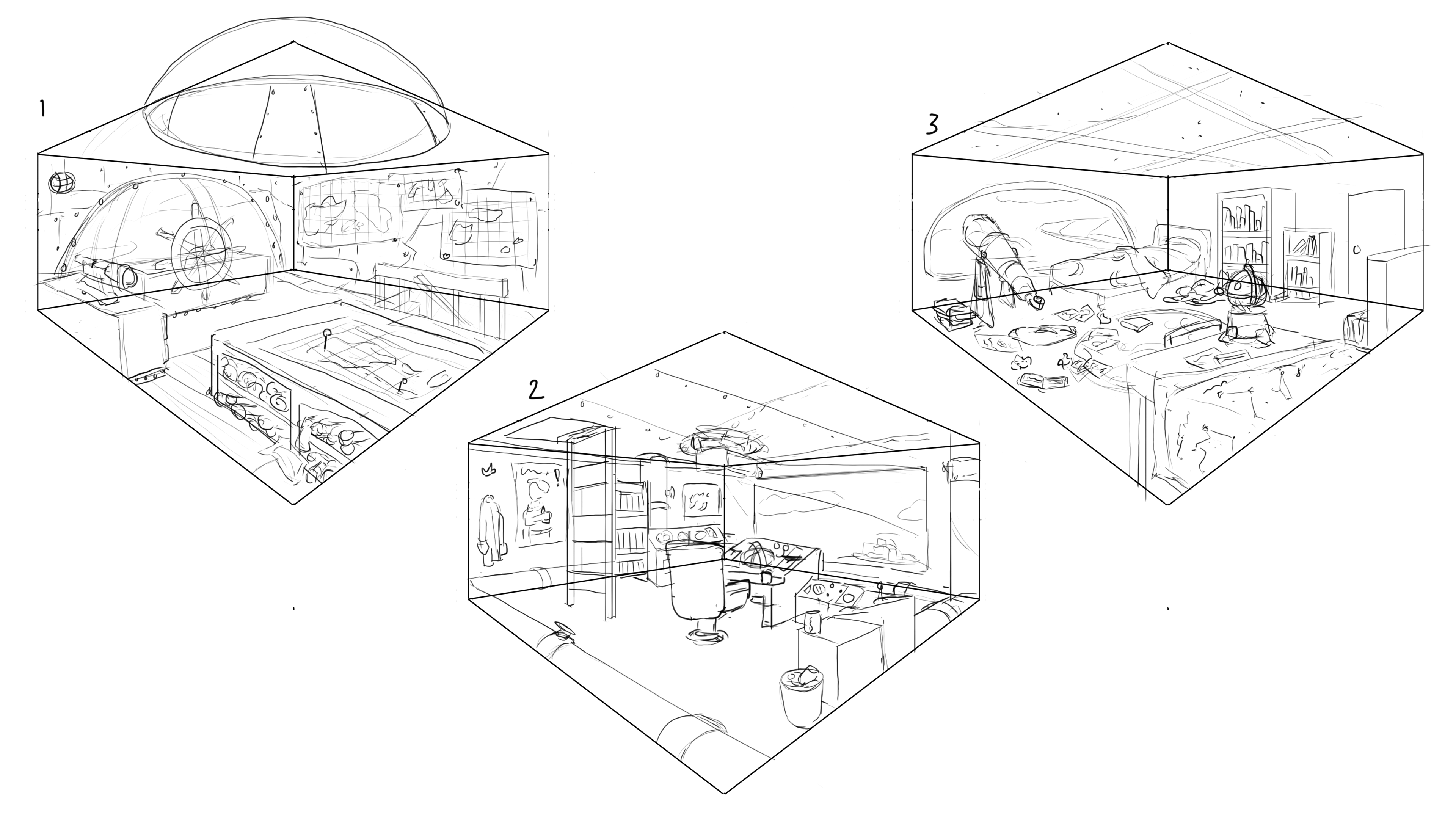
Initial room sketches for an airship
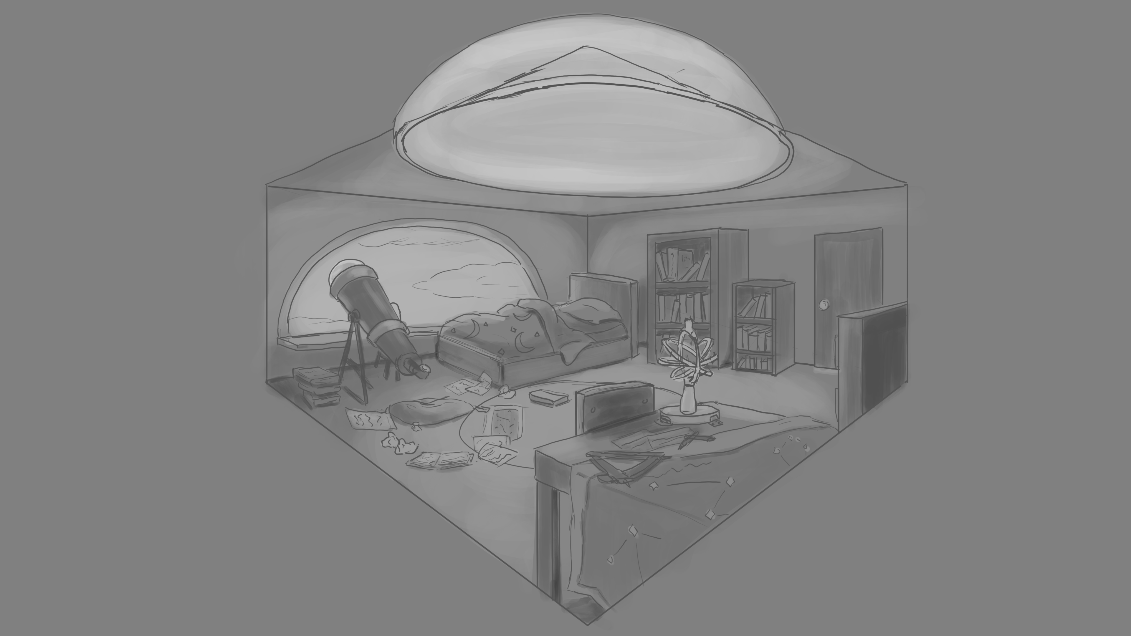
Settled on the astronomy one while incorporating the glass dome from the pilot room iteration
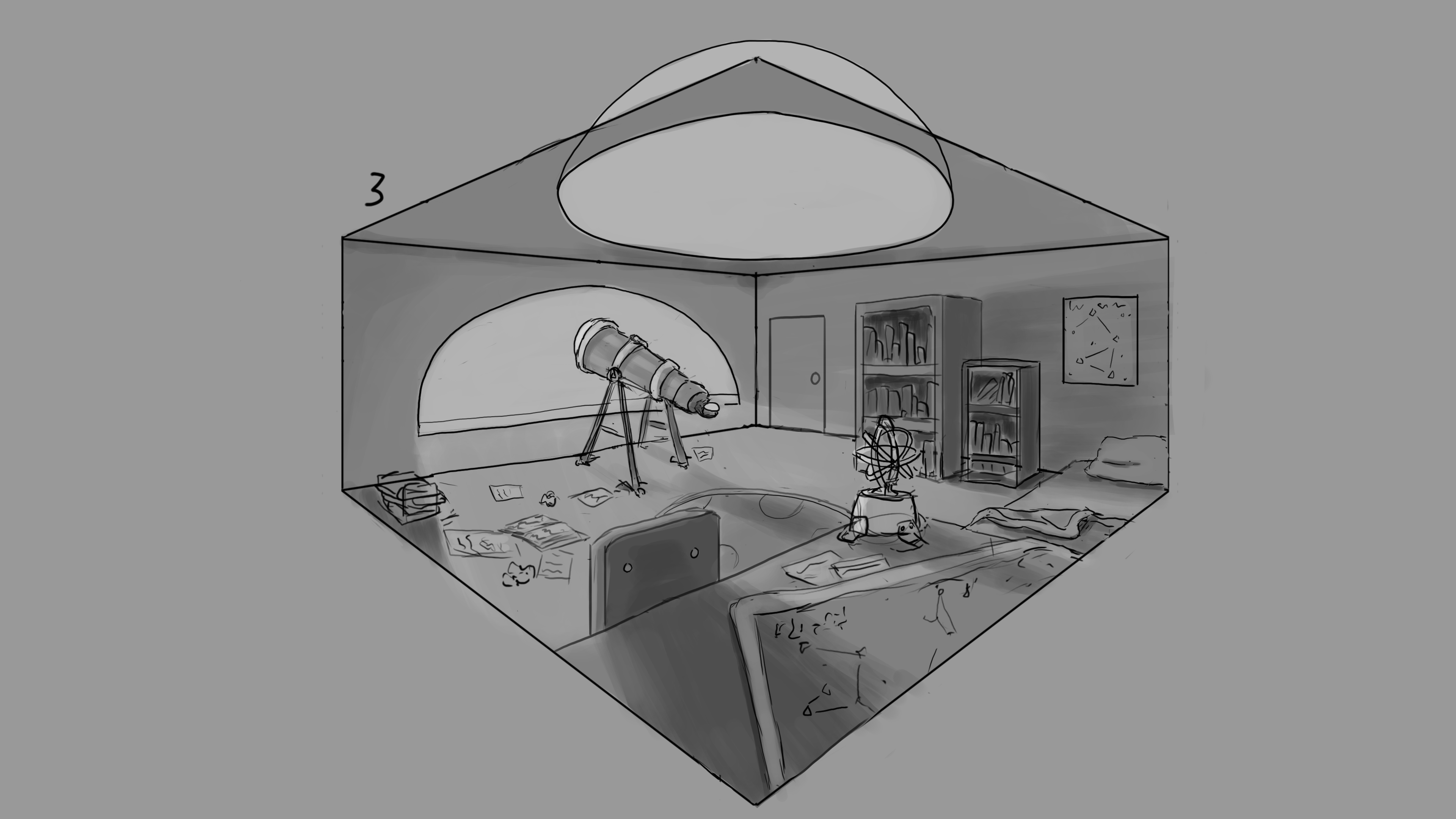
Moved some furniture around while pushing for some sharper details

More minor room/furniture adjustments as I also started to incorporate color
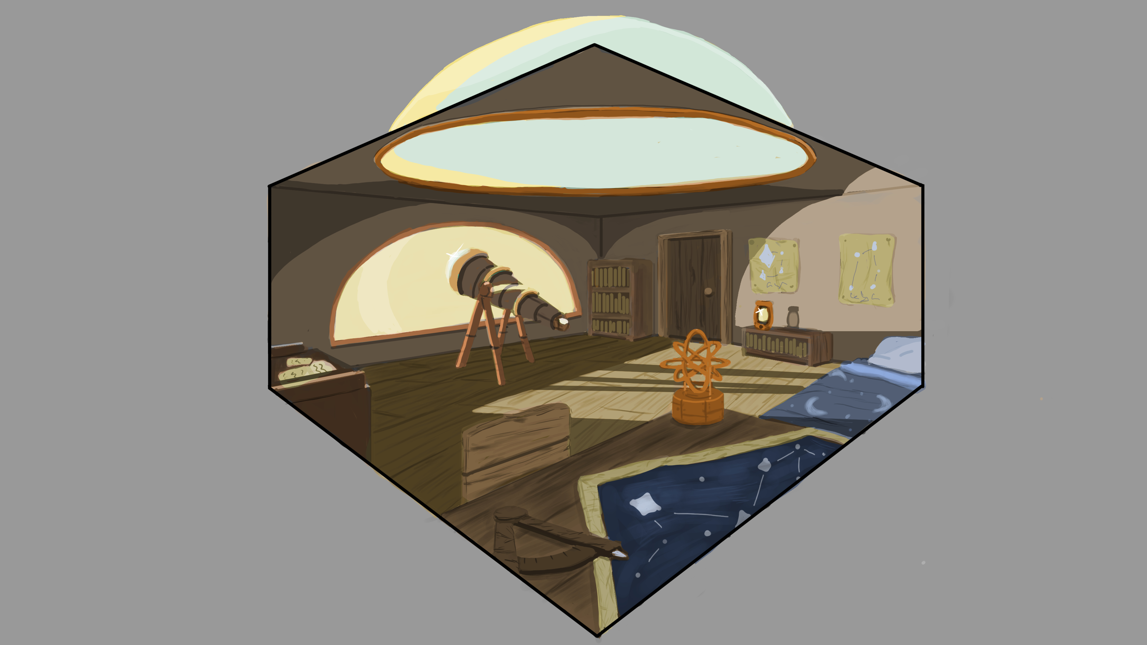
Final pass where I brought certain colors/saturations more in line. Figuring out light was a difficult one here
It's a bit late to be saying this, but I didn't realize just how expansive the course was in terms of covering the different aspects and styles of concept art. I used to think it was mostly just character design, without realizing that world building such as these room structures are just as if not more important when it comes to concept work.
The basis for this piece was a room on an airship where the resident living here was an astronomy student set in an earlier, more fantasy setting. While I couldn't quite get the airship feeling going, given that the focus was on the room itself, I enjoyed thinking about and adding in details that tell a story of whose room this is. The glass dome on top gave me quite a headache too, but it turned out nice.
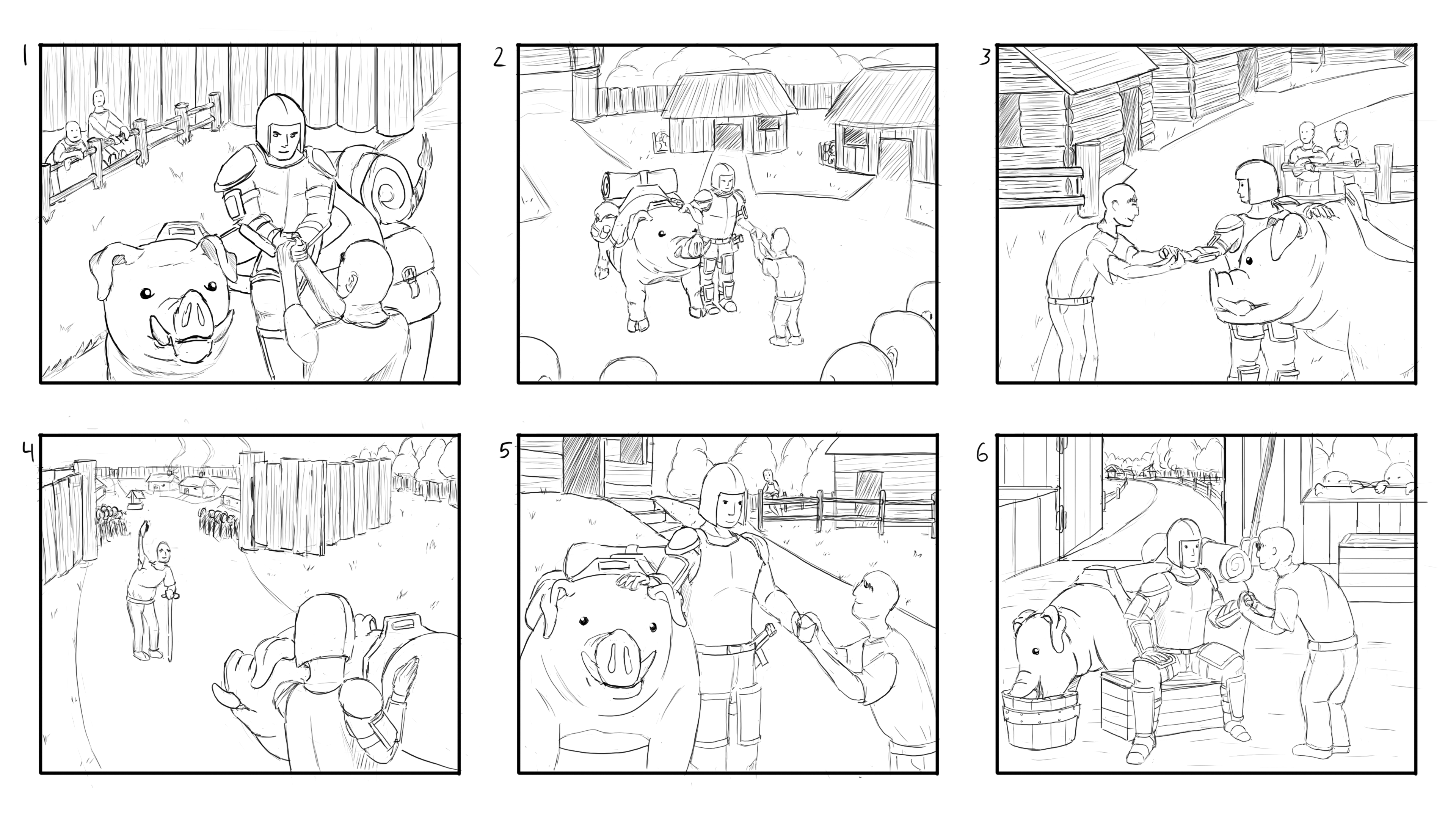
Initial sketches exploring various compositions and camera angles of warrior/elder interaction

Reworked the elder to be someone in position of power, and not just an old person
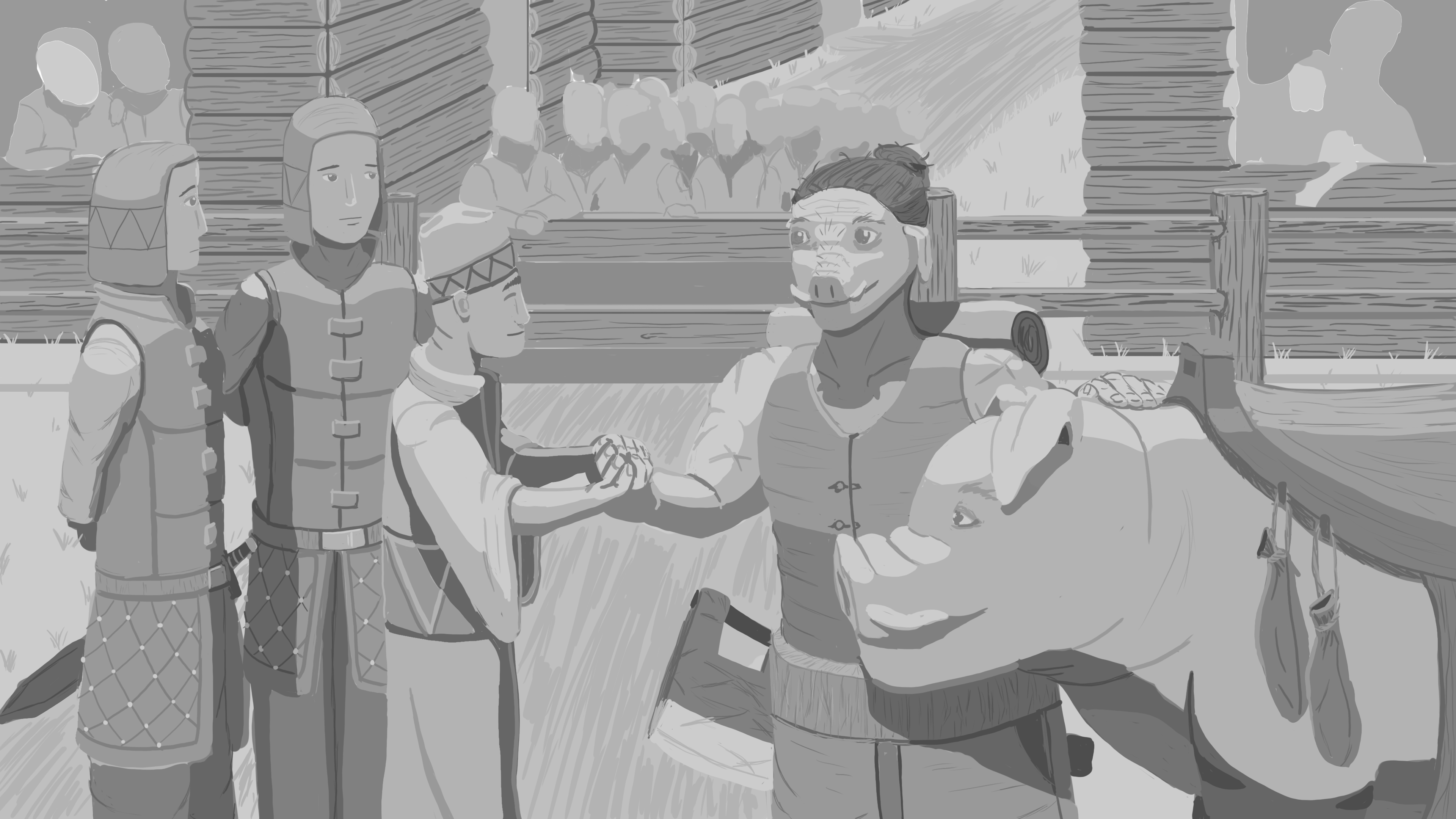
Settled on a redesign of initial warrior to make it clear they aren't from the village as well as extra detailing on the elder and his guards

Pushed value differences a bit to sharpen focus on main subjects
While the task seemed simple at first, this assignment took a lot more out of me than I thought it would. The prompt was somewhat simple; have a warrior/soldier entering a village while being welcomed by the elder of that village, with a focus on exploring different compositions and angle shots. Until now, I never realized how difficult it could be to create focus on two main characters in a shot where you needed to not only see said characters, but to also incorporate background characters without making the image too busy. My respects to all those artists who are actually able to find the time to draw faces even on background characters.

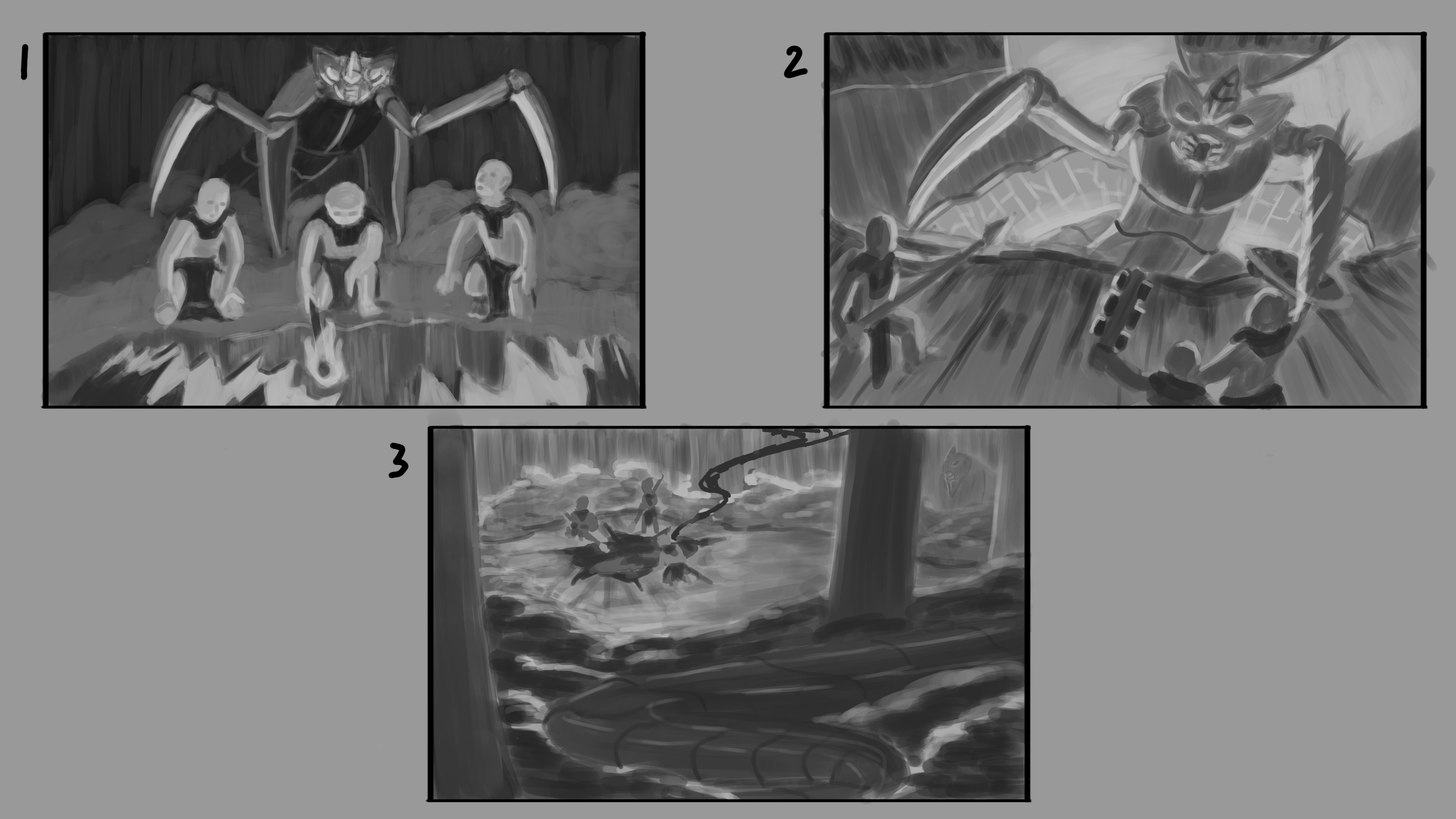
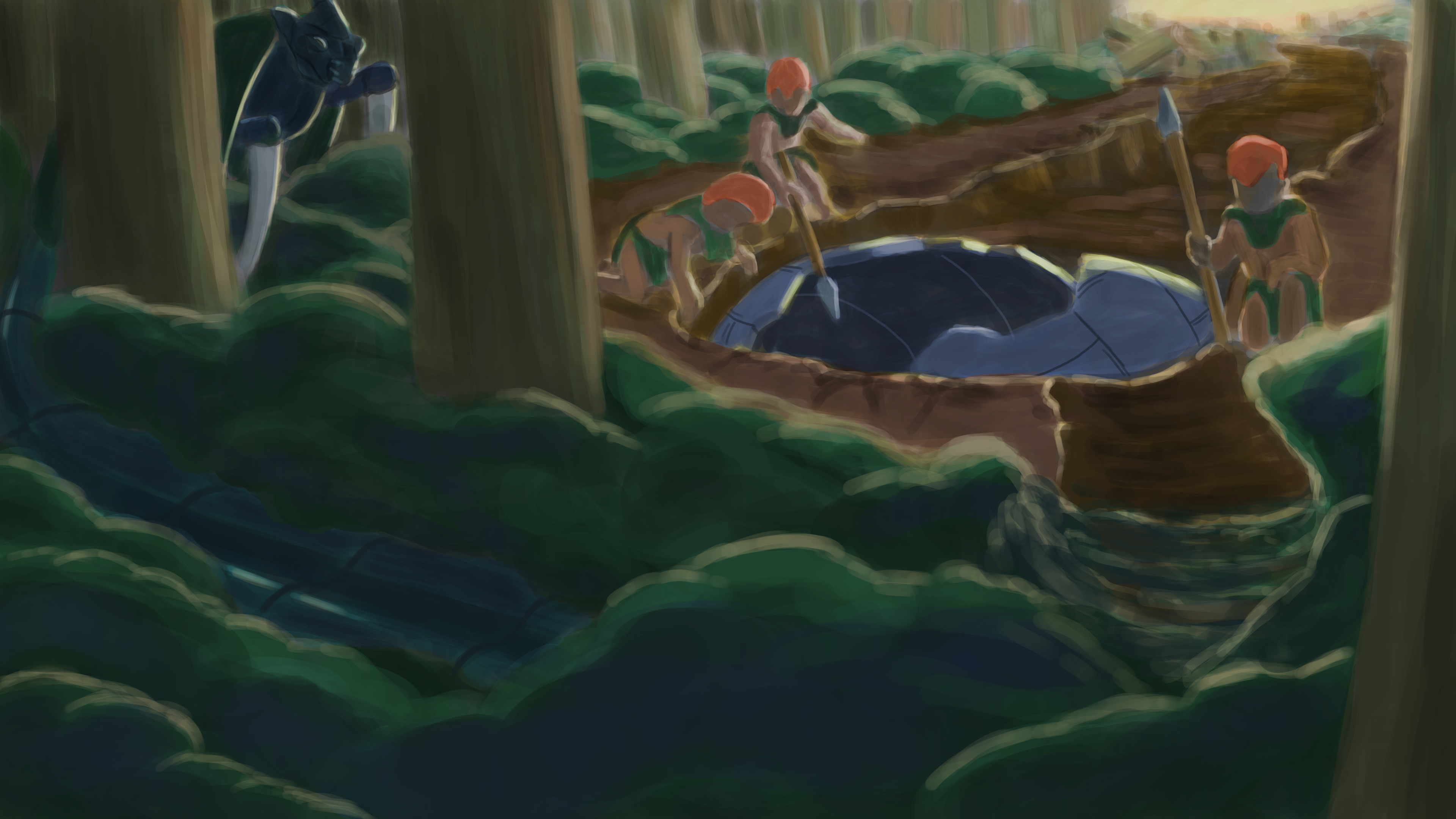
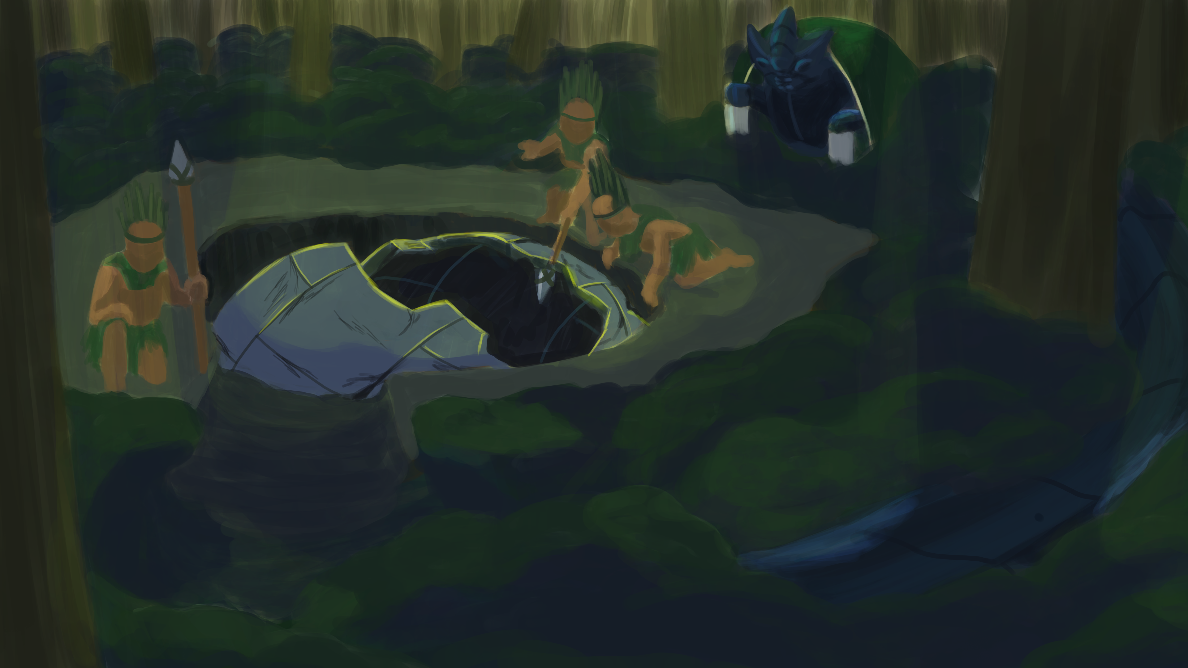
Similar to the previous assignment, this one took a slightly different approach to working with compositions where the focus was more on subject/focal point placements rather than just camera angles. The prompt was an alien invader being discovered by local, primitive warriors with an influence from Southern American warriors. It was tough balancing out the layout of the characters with the alien as well as the crash site, but by the time I got to colors I felt good with where the direction was headed. As usual, my color polish still needs a lot of work, but I think I was able to somewhat capture an eeriness/moment of tension in this piece that I was aiming for.
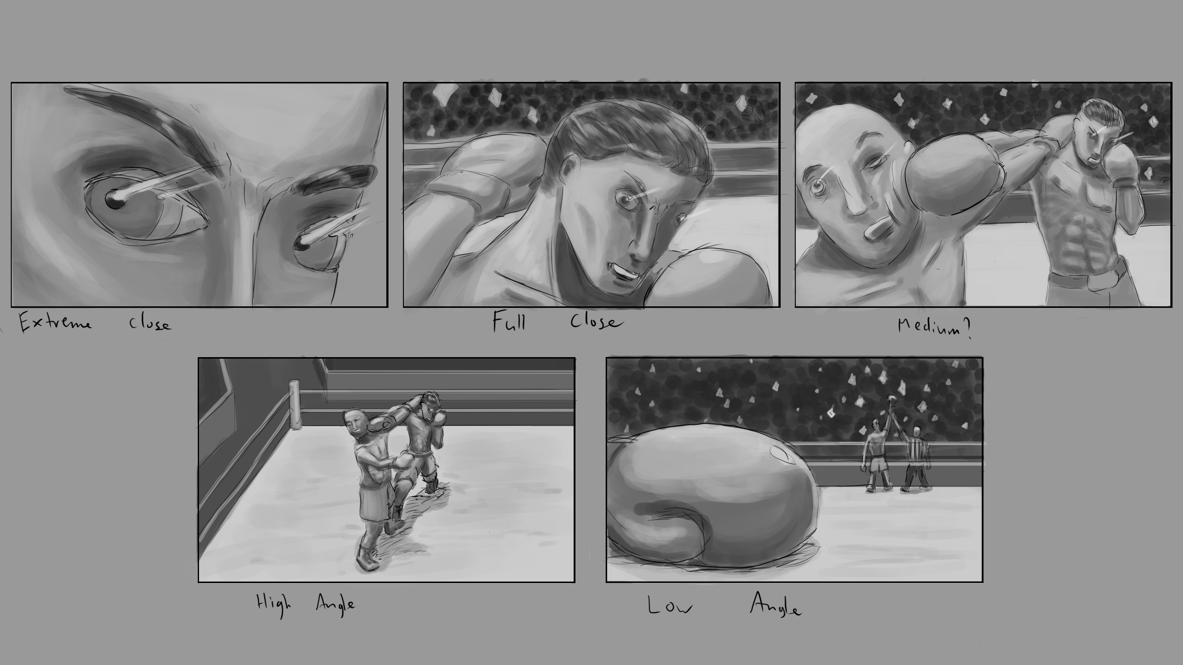
Exploration of various camera shots, aiming to capture a dramatic moment/crushing defeat
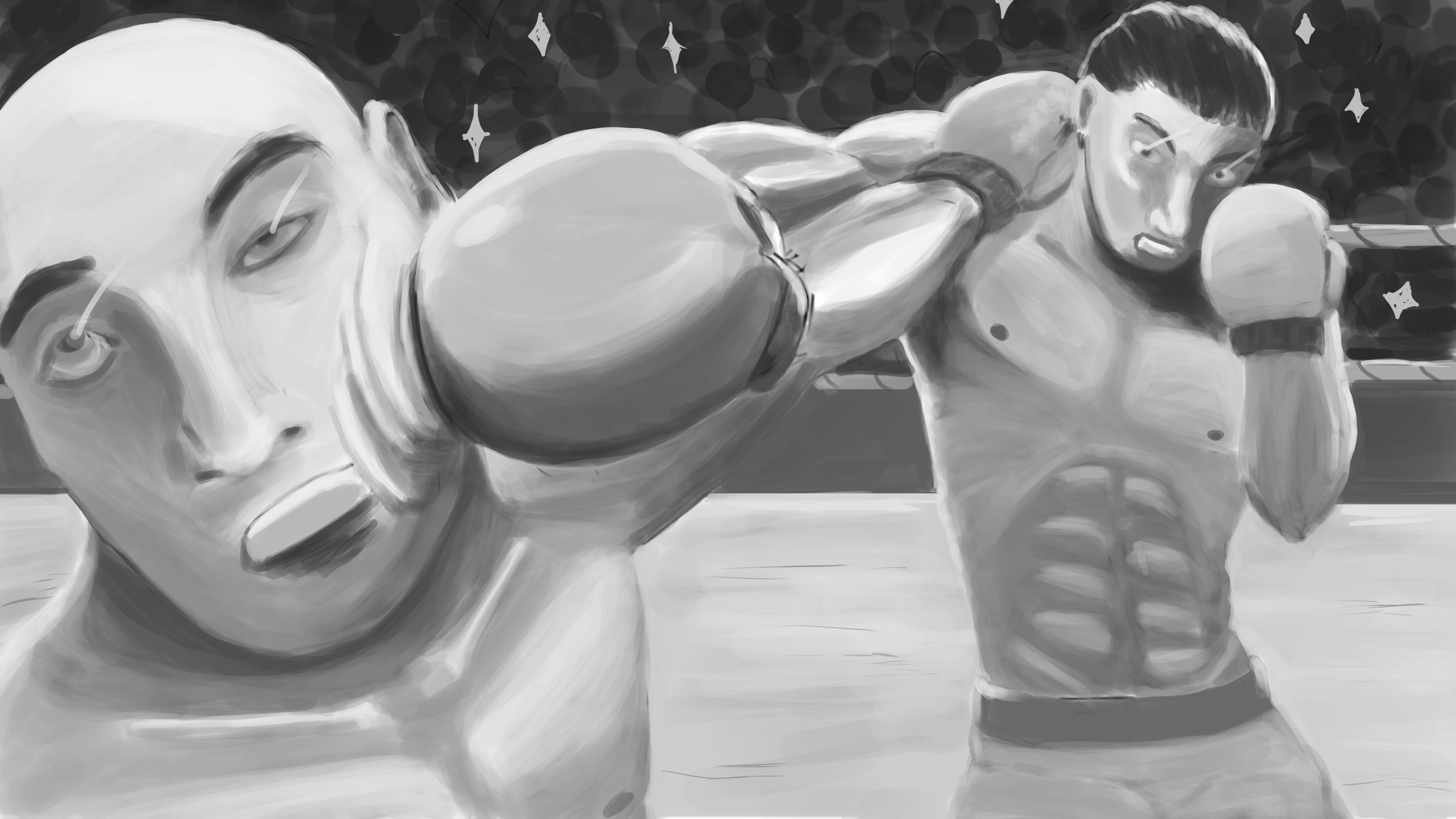
Choosing one of the previous shots and bringing it out to full detail, focusing heavily on value work
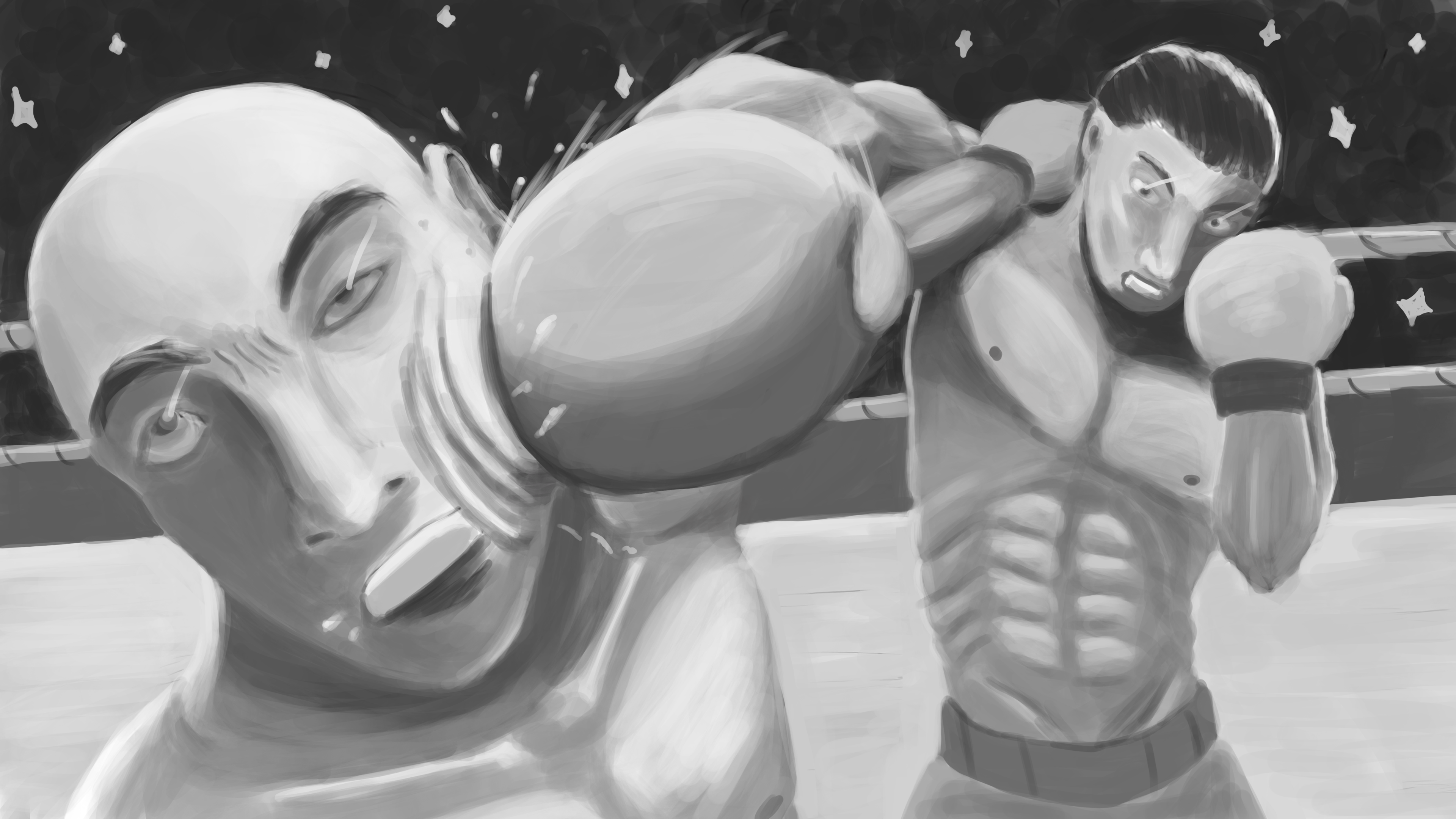
Post feedback adjustments where I tried to give more impact and liveliness to the figters
Unlike previous assignments, this one was more focused on camera angles and different camera shots as well. The prompt was loose and we were told to simply mess around with various camera shots so I started with an extreme close up that gradually moved further and further out. I aimed to capture a dramatic moment for these two boxers and focused on the moment of impact of a counter punch. It's assignments like these ones where having feedback from a mentor goes a long way, otherwise I would have struggled figuring out the little, but very important details, like the angle of the incoming arm or the twist of the body. Obviously not perfect, but better than what I could have done on my own.
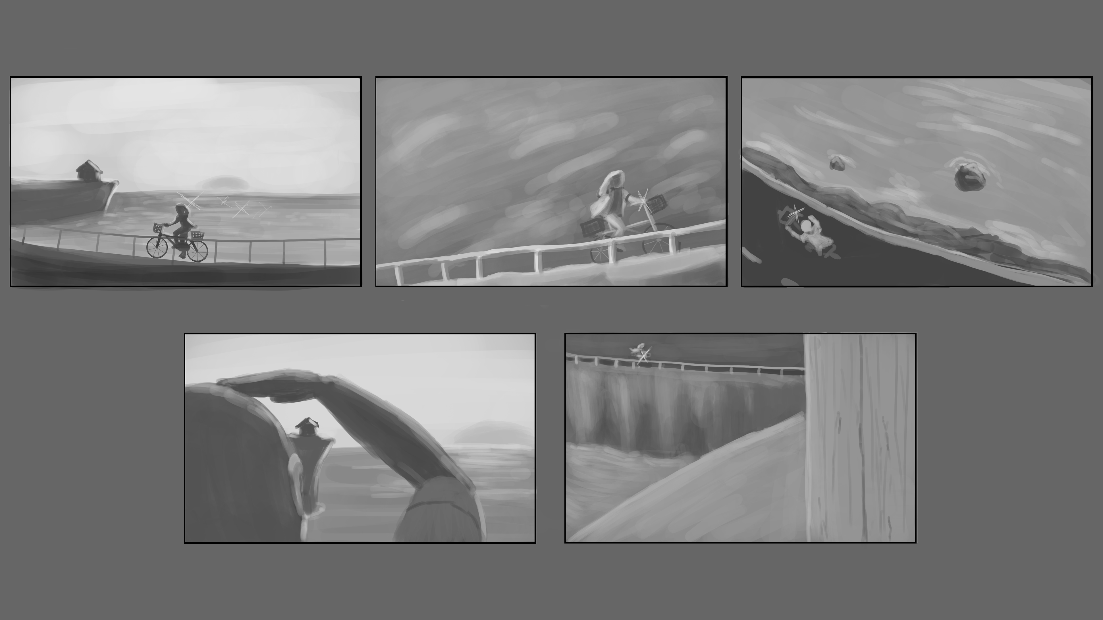
Initial sketch views exploring that classic sunset/rise moment
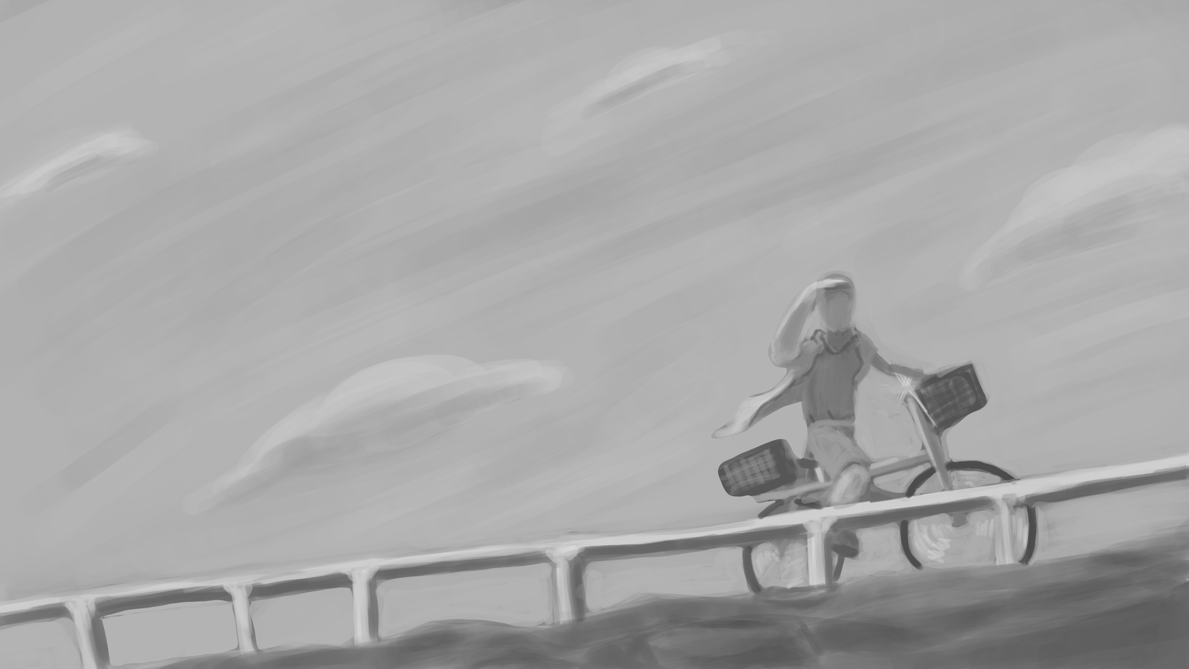
Settled on this distant shot with a focus on the character and an open background
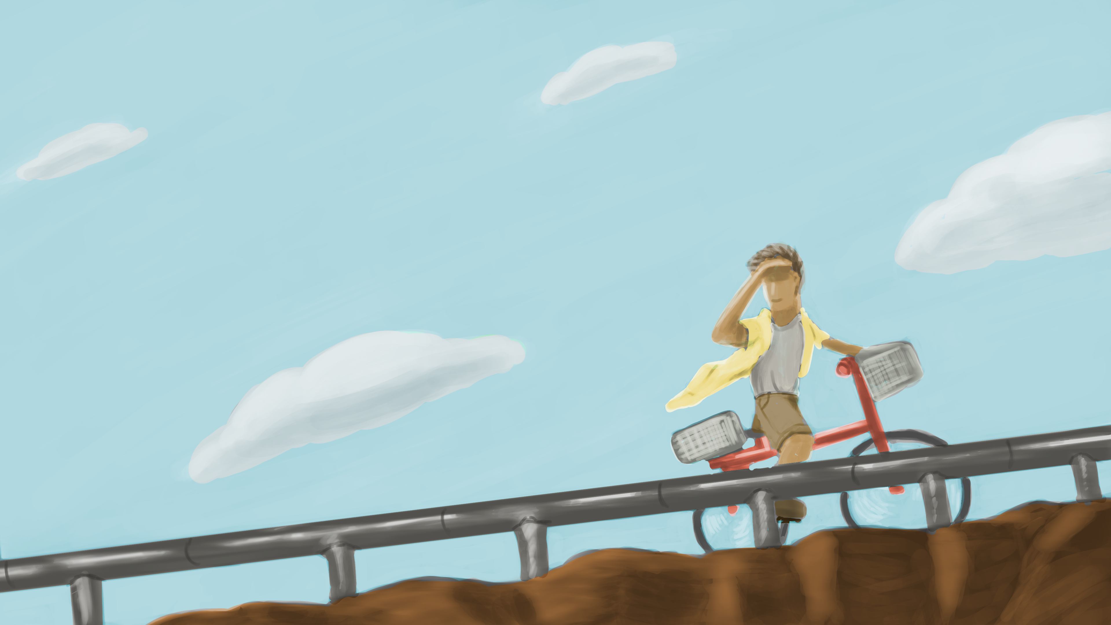
Couldn't figure out the gradient or how to make the background sky as expansive as I wanted, but being able to keep the warmth without direct sun is a plus
Winding down with the final assignment, we once again were tasked with different camera shots, though with a focus on a more scenic or wide shot narrative moment. I was actually listening to "La Bicicleta" by Shakira while I was working on this, so I ended up with this relaxed summer vibe of a boy riding his bicycle home. While I did decent in creating the relaxed atmosphere I was hoping for, the level of polish I expected from myself was quite there this time. It just means that even though these classes have finished up, I still have much more to discover and improve on when it comes to art.
Conclusions
If you actually read through everything and somehow made it this far, I really appreciate it! I know they're not the most exciting pieces and definitely far from the best there is out there, but keeping track and taking note of my own progress actually meant much more to me than I thought when I started this section. As mentioned in the beginning, while I had dabbled in art here and there, my time here at CG spectrum was when I really began to see significant improvement in my own art. Without it, I don't believe that I would have been able to build the confidence that I have today. I could go on, but I believe that's enough rambling from me. Thanks again for taking the time to look at my work!